The dark mode is a design with dark backgrounds and light text for the user interface. It reduces eye strain and saves battery life. Initially used for monochrome monitors, the industry later shifted to light backgrounds.
The resurgence of dark mode began in the late 2010s due to user demand and OLED screens. Apple and Google incorporated dark mode into their operating systems in 2019, making it a standard feature in modern software design.
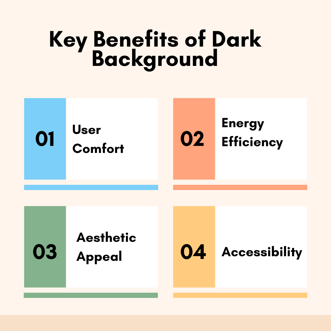
By integrating dark mode, designers aim to create a versatile, user-friendly interface that meets users' diverse needs and preferences while also taking advantage of the technical benefits associated with darker color schemes.
Did you know that switching to dark mode can help reduce eye strain? Scientific research shows that dark mode cuts down on the blue light emitted by screens, which is a common culprit for causing eye discomfort. Users have also mentioned that dark mode reduces glare, making it more comfortable to use apps and read on screens for longer periods without feeling tired.
2. Improved Readability in Low-Light Environments
Using dark mode is great for reading in low-light settings because it makes the screen easier on your eyes. It's especially handy at night or in dark rooms since you won't need to crank up the screen brightness, giving you a more enjoyable viewing experience.
Energy Efficiency
1. Battery Life Conservation on OLED and AMOLED Displays
Saving battery life on OLED and AMOLED screens is a great perk. When you switch to dark mode, fewer pixels light up, cutting power usage by a lot. Studies suggest that using dark mode can stretch your battery life by around 30% or even more, depending on how you use your device. This means less charging and more freedom for busy bees who are always on the move!
2. Environmental Impact of Reduced Energy Consumption
Using less energy by switching to dark mode is a win-win situation for the environment. It helps reduce our carbon footprint and supports efforts to protect the planet. Plus, companies that offer dark mode can show they care about the environment, which is a big plus for eco-conscious customers and stakeholders.
Aesthetic Appeal
1. Modern and Sleek Design Aesthetics
So, let's talk about how cool dark mode is for design! It's all about that modern and sleek vibe. Dark mode gives off a sophisticated look that many people love, especially in the tech and design scenes. It's like a fancy touch that sets brands apart and makes users feel special.
2. Enhanced Visual Focus and Minimalism
Plus, dark mode helps content shine by getting rid of distractions and keeping things simple. It's all about making the user experience cleaner and more enjoyable.
Accessibility
1. Benefits for Users with Light Sensitivity
Dark mode offers great advantages for users who are sensitive to light. It can help reduce discomfort and make screen time more bearable for those with light sensitivity or photophobia. The lower brightness levels and decreased glare can prevent headaches and other issues related to light sensitivity. By including dark mode as an option, applications become more inclusive, meeting a variety of user needs and preferences.
2. Supporting Users with Visual Impairments
Enhancing Readability: By using high contrast ratios in dark mode, text legibility can be enhanced for individuals with specific visual impairments. This simple adjustment makes reading and engaging with digital material much more manageable for them.
Personalization: Giving users the option to toggle between light and dark modes offers versatility, empowering them to select the mode that aligns best with their visual preferences and improves their accessibility journey.
By addressing these key benefits, dark mode not only enhances user comfort and experience but also supports energy efficiency, aesthetic preferences, and accessibility needs, making it an essential feature in modern UI/UX design.
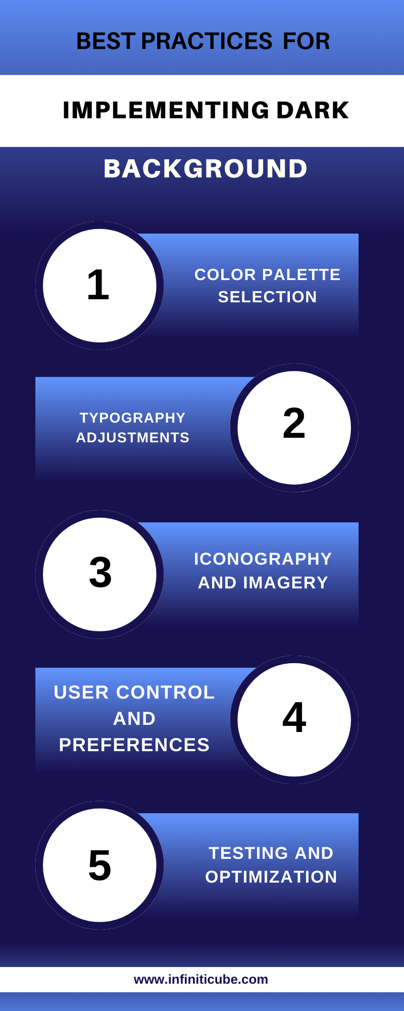
III. Best Practices for Implementing Dark Background
Color Palette Selection
1. Appropriate Use of Dark and Light Shades
Go for a Well-Balanced Palette: Instead of pure black, go for dark grays or muted dark colors to prevent harsh contrasts that can tire the eyes. This gives a modern yet gentle appearance, reducing eye strain.
Adding Pops of Color: Introduce vibrant accent colors in moderation to highlight key features without overshadowing the dark backdrop. Make sure they catch the eye without being too flashy.
2. Contrast Ratios for Readability
Make sure to follow the Web Content Accessibility Guidelines (WCAG) guidelines for contrast ratios when it comes to readability. For regular text, aim for a contrast ratio of at least 4.5:1, and for larger text, go for 3:1. This way, the text will still be easy to read against a dark background. Additionally, offers high contrast settings for users with visual impairments to make the text and interface elements even more visible.
3. Avoiding Pure Black and White for Comfort
Steer clear of using pure black as it can strain the eyes and make things too stark. Opt for a very dark gray for a more soothing look. Stay away from pure white too, as white text on a black background can be too glaring and uncomfortable to read. Try using off-white or light gray instead to keep things easy on the eyes while still being legible.
Typography Adjustments
1. Font Weight and Size Considerations
Let's talk about how to make text easier to read in dark mode. When it comes to font-weight, go for slightly thicker options to boost readability. Thin fonts can be tough to see against dark backgrounds. Also, make sure the font size is big enough so you don't have to squint. You might want to bump up the default size a bit for a smoother reading experience in dark mode.
2. Maintaining Legibility in Dark Mode
Make sure your text is still easy to read in Dark Mode by using anti-aliasing to smooth out those edges. Also, don't forget to adjust the letter spacing so your words don't look all squished together - that can be a problem in Dark Mode when there's less contrast.
Iconography and Imagery
1. Adapting Icons for Dark Backgrounds
Making Icons Pop on Dark Backgrounds - Make sure icons stand out on dark backgrounds by choosing lighter colors that contrast well. Keep the designs simple and bold to ensure they remain visible in dark mode.
2. Making Sure Images and Graphics Stand Out
Image Tweaks: Edit images to make sure they're easy to see on dark backgrounds. This could involve tweaking brightness, and contrast, or adding subtle borders or shadows.
Keeping a Uniform Look: Make sure all visual elements have a consistent style that fits the dark mode theme for a smooth user experience.
User Control and Preferences
1. Easy Toggle Between Dark and Light Modes
Switching between dark and light modes should be a breeze for users. Make sure there's a toggle that's easy to find, either in the settings or somewhere noticeable on the app or website. And when they flip that switch, give them instant feedback so they can see the changes right away, no need to refresh the page.
2. Don't forget User Choices for Future Visits
Long-Lasting Settings: Keep track of whether users prefer dark or light mode for their next visit. This can be done by using cookies or local storage so that their selection stays the same every time they come back to the site.
Coordinated Choices: If users are logged in, make sure their dark mode preference is the same on all devices and visits to make everything smooth sailing.
Testing and Optimization
1. Usability Testing for Dark Background
Let's test out how user-friendly the dark mode is by getting feedback directly from users. We'll see if it's easy to read, comfortable to use, and overall a good experience. Then, we'll do some A/B testing to compare how users interact with dark mode versus light mode. This will help us make design improvements based on real user data.
2. Continuous Feedback and Iteration
Let's keep tweaking that dark mode design by listening to what users have to say and staying on top of the latest design trends. Don't forget to chat with the community for more ideas and feedback through surveys, forums, or social media.
By following these best practices, designers can implement dark mode in a way that enhances user comfort, maintains readability, and provides a visually appealing and accessible experience for all users.
Check out these cool apps and websites that have Dark Mode! Let's talk about how this feature is integrated into major platforms like iOS and Android.
1. Implementation in Major Platforms (e.g., iOS, Android)
For iOS and macOS users, Apple rolled out a system-wide dark mode in iOS 13 and macOS Mojave. This means that all native apps support Dark Mode, allowing users to switch between light and dark themes easily. The focus here is on user comfort and energy efficiency, especially for devices with OLED displays.
On the Android side of things, Google also introduced a system-wide dark mode in Android 10. Just like Apple, this feature not only affects the system interface but also compatible apps. Google has given developers guidelines to ensure a smooth transition between light and dark modes, making sure users have a great experience while saving battery life on OLED screens.
2. Success Stories and User Feedback
Check out the stuff users are saying about Twitter and YouTube! On Twitter, people love the dark mode feature called Lights Out for its eye-friendly design and sleek look. It's a hit for reducing eye strain and giving a cool vibe for nighttime browsing.
On YouTube, users are raving about dark mode too. It's perfect for watching videos in dim lighting, with its dark background reducing glare and making video content pop. Users are enjoying a more immersive viewing experience, especially during long binge-watching sessions.
Design Systems and Guidelines
1. Material Design Guidelines for Dark Mode
Have you checked out Google's Material Design recommendations for incorporating dark mode into your app? They suggest using a dark grey background instead of pure black to be easier on the eyes, making sure text and icons have enough contrast, and opting for desaturated colors for a more pleasing look.
The focus is on keeping the interface readable and functional while offering a cool dark theme. When it comes to contrast and colors, they advise aiming for a minimum ratio of 15.8:1 for text and icons against dark backgrounds. They also recommend using primary colors for accents that pop without being too bright, which could be harsh on the eyes in dim settings.
2. Apple’s Human Interface Guidelines for Dark Mode
Apple's Human Interface Guidelines (HIG) offer a wealth of tips on how to smoothly incorporate dark mode into iOS and macOS apps. The focus is on crafting interfaces that look great and are easy on the eyes, whether in light or dark mode. Apple stresses the importance of dynamic color, where hues adjust to match the current appearance mode for a seamless user experience.
In terms of best practices, Apple advises against using pure black backgrounds, suggesting dark grey as a better alternative for improved readability and reduced eye strain. They also recommend tweaking the opacity of UI elements and making sure icons and images are optimized for dark backgrounds. Testing out dark mode implementations is key to ensuring all elements remain visible and user-friendly.
By examining these case studies and following established guidelines from major design systems, developers and designers can effectively implement dark mode in their applications, providing users with a comfortable, efficient, and visually appealing experience.
1. Dealing with Old Systems and Making Them Work in Dark Mode
The problem with older systems is that they weren't built with dark mode in mind. This means it's a real pain to add this feature without making big changes. The old code might not be flexible enough to handle dark mode, so developers have to put in a lot of work to get it right.
Plus, getting dark mode to work smoothly on all kinds of devices and operating systems can be a headache. Each platform handles it differently, which can mess up the user experience. Developers really have their work cut out for them testing and tweaking everything to make sure it all runs smoothly.
2. Performance Issues in Certain Scenarios
When Things Get Slow: Dark mode might make your device take a breather, especially if it's not the most powerful one out there. Switching themes on the fly can sometimes make things a bit sluggish, affecting how smooth your user interface feels.
Bright Ideas for Battery Life: While dark mode is usually a battery saver on OLED screens, it might not work as well on LCD screens and could even end up draining more power because of how these screens handle dark colors differently.
User Acceptance
1. Varied User Preferences and Feedback
A mix of Preferences: Users like different looks for their interfaces. Some enjoy the cool vibes of dark mode, while others stick to the classic light mode because it feels cozy and clear. To make everyone happy, it's important to give options for customization and make sure both modes work smoothly.
Listening to Users: Taking in user feedback is key to making dark mode better. People might run into problems or have ideas for improvements, so it's important to keep updating and fine-tuning dark mode based on what users have to say.
2. Educating Users About Dark Mode Benefits
Let's chat about the perks of using dark mode and how we can help users get on board with it. Some folks might not know all the cool benefits or how to turn it on, so it's crucial to spread the word. We can do this through things like in-app guides, pop-up messages, and articles that talk about why dark mode rocks - like how it's easier on the eyes and saves battery life.
We should also make sure users know exactly how to switch between light and dark modes and offer some tips for a smoother experience. It's all about making sure they feel confident in customizing their settings and getting the most out of their device.
It's super important to tackle these challenges and factors head-on when it comes to nailing dark mode. When developers grasp the technical hurdles, put user needs first, and educate them well, they can craft a dark mode experience that's welcoming, accessible, and totally rocks all the advantages it offers.
VI. Future Trends in Dark Background Design
Integration with Emerging Technologies
1. Dark Mode in AR/VR Environments
Let's talk about how dark mode can level up your AR and VR game. As AR and VR tech keeps getting better, using dark mode can boost user experience. It helps reduce eye strain by toning down the contrast between virtual stuff and real backgrounds or VR worlds. But hey, it's not just about slapping on a dark theme – you gotta design it right.
Dark mode in AR/VR needs to be easy on the eyes while still keeping things readable and usable. And we might even see cool new tricks like adaptive lighting that adjust brightness based on where you are in the real or virtual world. Exciting stuff!
2. Voice User Interfaces and Dark Mode
A Perfect Match: With the rise of voice user interfaces (VUIs) in our everyday gadgets, dark mode has emerged as a handy companion. It offers a soothing visual experience that minimizes glare, making it ideal for voice interactions, especially in dimly lit environments.
Enhanced Visual Cues: Dark mode in VUIs is not just about aesthetics; it also boosts the visibility of important visual feedback elements like confirmation lights and status indicators. This makes interactions with voice-controlled devices smoother and more satisfying for users.
Advanced Customization
By exploring these future trends, dark mode design can continue to evolve and integrate with emerging technologies, offering advanced customization and adaptive features that enhance user comfort, engagement, and overall experience.
1. Personalization Options for Users
Users can make dark mode their own with all the cool customization options available. From picking different shades of dark backgrounds to adjusting accent colors, you can even set preferences for certain apps or times of day. Having such detailed control over these settings lets you tailor the interface to suit your needs and boost your satisfaction and engagement with the app or website.
2. Adaptive Dark Mode Based on Context and Environment
Imagine a smart Dark Mode that changes based on where you are and what's around you. Picture this: your device senses the lighting and time of day, switching to dark mode in dim settings or at night, then back to light mode when it's bright. By using AI and machine learning, this feature can even learn your habits and preferences, making it super intuitive and personalized for you no matter where you are or what device you're using.
VII. Conclusion
Dark mode benefits include reducing eye strain, saving battery, improving aesthetics, and enhancing accessibility. Best practices include color selection, typography adjustments, icon adaptation, user control, and testing. Dark mode has become essential in UI/UX design, evolving with technology and user preferences. Implementing dark mode effectively is crucial for designers to meet user expectations and improve the overall user experience.
Designers and developers must prioritize dark mode implementation to meet user expectations and enhance the overall user experience. By adhering to best practices and staying informed about future trends, they can ensure that dark mode remains a robust and beneficial feature in their design toolkit.
Free Consultation
If you're interested in enhancing your application's user experience with dark mode or other UI/UX design features, consider taking advantage of free consultation services. Our expert team can provide personalized advice and strategies to help you implement the best practices and stay ahead of design trends. Contact us today for a free consultation and start improving your UI/UX design!
He is working with infiniticube as a Digital Marketing Specialist. He has over 3 years of experience in Digital Marketing. He worked on multiple challenging assignments.
Our newsletter is finely tuned to your interests, offering insights into AI-powered solutions, blockchain advancements, and more. Subscribe now to stay informed and at the forefront of industry developments.


 June 27, 2025
 Balbir Kumar Singh
 0
0