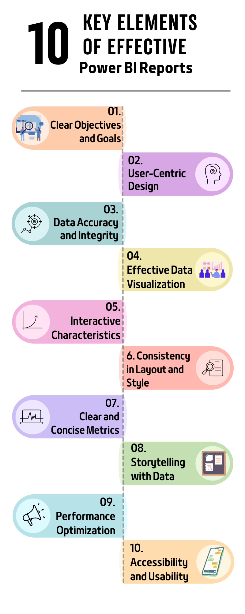
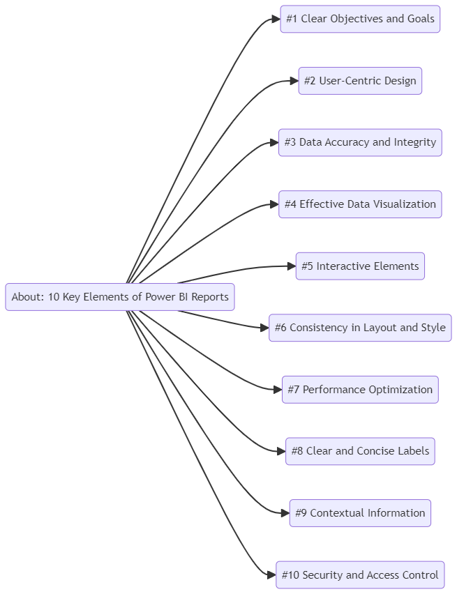
Guidance and Focus: Clearly defining the purpose of a Power BIreport provides direction and ensures that the report is focused on specific business needs. This helps in avoiding the inclusion of irrelevant data and visualizations, making the report more effective and easier to interpret.
Alignment with Business Objectives: A well-defined purpose ensures that the report aligns with the broader business objectives, facilitating better decision-making and strategic planning.
Steps to Define the Purpose:
Identify Stakeholders:
Determine who will be using the report and what their specific needs are. This could include executives, managers, analysts, or operational staff.
Understand Business Context:
Gain a thorough understanding of the business environment and the specific context in which the report will be used. This includes understanding the industry, market conditions, and internal business processes.
Specify Key Questions:
Identify the key questions that the report aims to answer. For example, “How are sales performing across different regions?” or “What is the current status of our project timelines?”
Set Clear Objectives:
Based on the stakeholder needs and key questions, set clear and measurable objectives for the report. For instance, the objective could be to provide insights into sales trends, monitor project progress, or analyze customer behavior.
If the purpose of the report is to monitor sales performance, the objectives might include:
Providing a monthly sales overview.
Highlighting top-performing products and regions.
Identifying sales trends and patterns.
Identify Key Performance Indicators (KPIs) and Metrics
Importance of KPIs and Metrics:
Measuring Performance: KPIs and metrics are essential for measuring performance against business objectives. They provide quantifiable data that can be tracked over time.
Decision-Making: Relevant KPIs and metrics facilitate informed decision-making by highlighting areas of success and identifying opportunities for improvement.
Steps to Identify KPIs and Metrics:
Align with Business Objectives:
Ensure that the KPIs and metrics are directly aligned with the overall business objectives and the specific goals of the report. For example, if the business aims to increase customer satisfaction, relevant KPIs might include customer satisfaction and net promoter scores.
Consult Stakeholders:
Engage with stakeholders to identify which KPIs and metrics are most valuable to them. This ensures that the report meets their needs and provides actionable insights.
Select Relevant Metrics:
Choose metrics relevant to the report's purpose and the business context. Avoid including too many metrics, as this can lead to information overload and make the report less effective.
Ensure Data Availability:
Verify that the necessary data to calculate the selected KPIs and metrics is available and reliable. This might involve integrating data from various sources or setting up new data collection processes.
Examples of KPIs and Metrics:
Sales Performance Report:
Total Sales Revenue: The total income from sales over a specific period.
Sales Growth Rate: The percentage increase or decrease in sales over time.
Average Order Value: The average amount spent per order.
Sales by Region/Product: Breakdown of sales performance by different regions or products.
Customer Satisfaction Report:
Customer Satisfaction Score (CSAT): A measure of customer satisfaction based on survey responses.
Net Promoter Score (NPS): A metric that gauges customer loyalty by asking how likely customers are to recommend the business to others.
Customer Churn Rate: The percentage of customers who stop using the product or service over a specific period.
Average Response Time: The average time taken to respond to customer inquiries.
Best Practices:
SMART Criteria: Ensure that KPIs and metrics are Specific, Measurable, Achievable, Relevant, and Time-bound.
Regular Review: Periodically review and update KPIs and metrics to ensure they remain relevant to changing business objectives and conditions.
Visualization: Use appropriatevisualizations in Power BI to represent KPIs and metrics effectively. For instance, use bar charts for comparison, line charts for trends, and pie charts for composition.
Defining the purpose of the report and identifying the key performance indicators and metrics are crucial steps in creatingeffective Power BIreports. By focusing on these elements, you can ensure that your reports are aligned with business objectives, provide valuable insights, and support informed decision-making.
Relevance and Usability: Knowing the target audience ensures that the report is relevant and useful to those who will use it. Different users have different needs and levels of expertise.
Effective Communication: Understanding the audience helps in tailoring the communication style and complexity of the report to suit their preferences and comprehension levels.
Steps to Understand the Target Audience:
Identify Key Users:
Determine who will be using the report. This could include executives, managers, analysts, or operational staff.
Assess User Needs:
Conduct interviews, surveys, or workshops to gather information on what users need from the report. Understand their objectives, challenges, and what decisions they aim to make using the report.
Evaluate Technical Proficiency:
Assess the technical skills and data literacy of the audience. This will help in deciding the complexity of the visualizations and the level of detail to include.
Understand Business Context:
Understand the specific business functions and processes that the users are involved in. This helps in ensuring that the report provides actionable insights relevant to their roles.
Example:
For a sales performance report aimed at executives, the focus might be on high-level KPIs and strategic insights. For sales managers, more detailed data on individual sales reps and product performance might be required.
Start with Our Guide to Effective Power BI Reporting!
Design Reports that are Intuitive and User-Friendly
Principles of Intuitive and User-Friendly Design:
Simplicity: Keep the design simple and avoid clutter. Use white space effectively to make the report easy to read and navigate.
Consistency: Maintain a consistent design language throughout the report. Use standardized colors, fonts, and layouts to create a cohesive experience.
Accessibility: Ensure the report is accessible to all users, including those with disabilities. Use clear fonts, and high-contrast colors, and ensure that all interactive elements are keyboard navigable.
Steps to Design Intuitive Reports:
Layout and Structure:
Organize the report in a logical and structured manner. Group related information together and use clear headings and sections.
Visualization Best Practices:
Choose the right type of visualization for the data being presented. Use bar charts for comparisons, line charts for trends, pie charts for composition, etc.
Avoid overloading visuals with too much information. Focus on the most important data points.
Interactive Elements:
Include interactive features like slicers, filters, and drill-throughs to allow users to explore the data dynamically.
Use tooltips and hover effects to provide additional context without cluttering the main visuals.
Guidance and Navigation:
Provide clear instructions and guidance on how to use the report. Use tooltips, labels, and annotations to help users understand the data.
Ensure that navigation is intuitive, with easily accessible menus and links.
Example:
An intuitive sales dashboardmight feature a top-level overview of total sales, with options to drill down into specific regions, products, or sales reps. Interactive filters could allow users to customize the view based on time periods or other criteria.
Incorporate User Feedback into the Design Process
Importance of User Feedback:
Continuous Improvement: User feedback is essential for continuous improvement of the report. It helps in identifying areas for enhancement and ensuring the report remains relevant and useful.
User Satisfaction: Involving users in the design process increases their satisfaction and engagement with the report. It ensures that the report meets their needs and expectations.
Steps to Incorporate User Feedback:
Collect Feedback:
Use surveys, interviews, or focus groups to gather feedback from users. Ask about their experience with the report, what they find useful, and what could be improved.
Implement feedback mechanisms directly within the report, such as feedback forms or comment sections.
Analyze Feedback:
Analyze the feedback to identify common themes and areas for improvement. Look for patterns in the suggestions and criticisms provided by users.
Prioritize Changes:
Prioritize changes based on the impact on user experience and business objectives. Focus on high-impact improvements that can be implemented quickly.
Iterate and Improve:
Make iterative changes to the report based on the feedback. Test the changes with users to ensure they address the issues and enhance the report.
Continuously seek feedback and iterate to keep the report aligned with evolving user needs.
Example:
If users find that a sales performance report is too cluttered, gather specific feedback on which elements are unnecessary. Simplify the design based on this feedback, perhaps by removing less critical metrics or consolidating similar data points.
Conclusion:
Designing Power BI reports with auser-centric approachensures that they are not only visually appealing but also highly functional and relevant to the target audience. By understanding the users, creating intuitive designs, and incorporating feedback, you can create reports that effectively support decision-making and drive business success.
Decision-Making: Accurate and current data is crucial for informed decision-making. Inaccurate or outdated data can lead to poor decisions, affecting business performance.
Trust: Maintaining data accuracy and currency builds trust among users. If users trust the data, they are more likely to rely on the reports for their analyses and decision-making.
Steps to Ensure Data Accuracy and Currency:
Automated Data Refresh:
Set up automated data refresh schedules in Power BI to ensure the data is updated regularly. This can be daily, weekly, or real-time, depending on the business needs.
Data Quality Monitoring:
Implement monitoring systems to track the quality of the data. This includes checking for anomalies, missing data, and other issues affecting accuracy.
Source Verification:
Verify the data sources to ensure they are reliable and authoritative. Cross-check data with multiple sources if possible to validate its accuracy.
Timely Updates:
Ensure that data is collected and updated promptly. Delays in data updates can render the information obsolete.
Example:
For a sales report, setting up a daily data refresh from the sales database ensures that the latest sales figures are always available. Regular monitoring can catch and correct discrepancies before they affect the report.
Implement Data Validation and Cleansing Processes
Importance of Data Validation and Cleansing:
Data Quality: Data validation and cleansing are essential to maintain the quality and reliability of the data. Clean data ensures that the reports are accurate and useful.
Error Reduction: These processes help in identifying and correcting errors in the data, such as duplicates, missing values, or outliers.
Steps to Implement Data Validation and Cleansing:
Data Validation Rules:
Define and apply data validation rules to check the accuracy and consistency of the data. This can include range checks, format checks, and completeness checks.
Automated Cleansing Tools:
Use automated data cleansing tools and scripts to identify and correct errors in the data. Tools like Power Query in Power BI can be used for data transformation and cleansing.
Manual Review:
Conduct regular manual reviews of the data to identify issues that automated tools might miss. This involves spot-checking data and verifying its accuracy.
Standardization:
Standardize the data formats and units of measurement to ensure consistency. This includes standardizing date formats, currency units, and categorical variables.
Example:
For a customer database, validation rules might include checking that email addresses follow a standard format, phone numbers are complete, and there are no duplicate entries. Automated cleansing might remove extra spaces, correct misspellings, and standardize address formats.
Establish a Reliable Data Source Connection
Importance of Reliable Data Source Connections:
Data Availability: A reliable connection to data sources ensures that the data is available when needed. Unreliable connections can lead to missing or incomplete data in reports.
Consistency: Consistent data connections help maintain the integrity of the data. Inconsistent connections can result in discrepancies and errors.
Steps to Establish Reliable Data Connections:
Robust Infrastructure:
Ensure that the data infrastructure is robust and capable of handling the data load. This includes reliable servers, databases, and network connections.
Connection Settings:
Configure connection settings correctly in Power BI. Use appropriate authentication methods and connection strings to establish secure and reliable connections.
Redundancy and Backup:
Implement redundancy and backup systems to ensure data availability even if a primary data source fails. This can involve setting up secondary data connections or using cloud-based backups.
Monitoring and Alerts:
Set up monitoring systems to track the status of data connections. Implement alerts to notify administrators of any connection issues so they can be addressed promptly.
Example:
For a financial report that pulls data from a corporate database, ensuring a stable and secure VPN connection can prevent data interruption. Regular monitoring of this connection helps detect issues early, and having a backup data source can provide continuity in case of primary source failure.
Conclusion:
Maintaining data accuracy and integrity is foundational to the effectiveness of Power BI reports. By ensuring that data is accurate and up-to-date, implementing robust data validation and cleansing processes, and establishing reliable data source connections, you can create reports that users trust and rely on for accurate insights and informed decision-making.
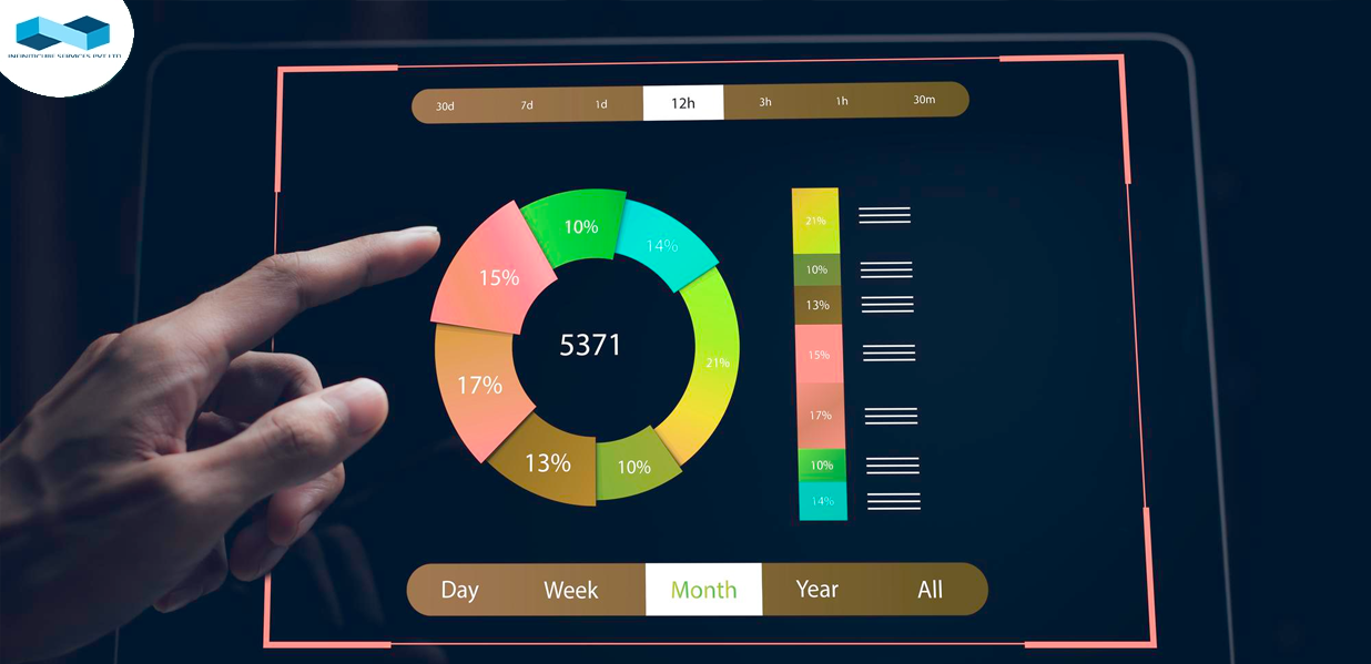
For a report analyzing monthly sales performance, a line chart would effectively show sales trends over time, while a bar chart could compare sales across different regions for the same period.
Use Color and Formatting to Enhance Readability
Importance of Color and Formatting:
Highlighting Key Information: Effective use of color and formatting can draw attention to important data points and trends.
Readability: Proper formatting enhances readability and helps users quickly grasp the insights.
Best Practices for Color and Formatting:
Consistent Color Scheme:
Use a consistent color palettethroughout the report. This helps in maintaining visual harmony and making the report look professional.
Highlighting Key Data:
Use contrasting colors to highlight key data points or trends. For example, use a bold color for a target line in a chart.
Color Theory:
Apply basic color theory principles. Use warm colors (red, orange) for highlights and cool colors (blue, green) for background or less critical information.
Avoid Overuse of Colors:
Limit the number of colors used in a single visualization to avoid confusion. Too many colors can make the visualization look cluttered and hard to interpret.
Font and Text:
Use clear and readable fonts. Ensure that text sizes are appropriate and legible, even when the report is viewed on different devices.
Formatting Numbers:
Format numbers for readability, such as using commas for thousands and appropriate decimal places.
Example:
In a sales performance dashboard, use different shades of blue to represent different regions in a bar chart. Highlight the highest sales figures in a bold color like red to draw attention.
Avoid Clutter and Overloading Visuals with Too Much Information
Importance of Avoiding Clutter:
Clarity: Clutter-free visuals are easier to read and interpret. Too much information can overwhelm users and obscure key insights.
Focus: Simplified visuals help users focus on the most important data points and trends.
Tips to Avoid Clutter:
Prioritize Information:
Identify and prioritize the most important data points and trends. Focus on these in your visualizations.
Use White Space:
Use white space effectively to separate different elements of the visualization. This makes the report look clean and organized.
Limit Data Points:
Avoid including too many data points in a single visualization. Simplify where possible by aggregating or filtering the data.
Simplify Legends and Labels:
Use clear and concise legends and labels. Avoid overly detailed descriptions that can distract from the main visualization.
Interactive Elements:
Use interactive elements like tooltips, drill-downs, and filters to provide additional information without cluttering the main visualization.
Example:
In a sales dashboard, instead of displaying detailed sales data for every product, aggregate the data to show the top five products and provide an option to drill down for more details if needed. Use white space to separate different sections of the dashboard, making it easier to navigate.
Conclusion:
Effective data visualization is critical for creating impactful Power BI reports. By choosing the right types of visualizations, using color and formatting to enhance readability, and avoiding clutter, you can ensure that your reports are not only visually appealing but also highly informative and easy to understand. This approach helps in conveying key insights clearly and supports better decision-making.
Include Interactive Features Like Slicers, Filters, and Drill-Throughs
Importance of Interactive Features:
User Engagement: Interactive features make the report more engaging and user-friendly. They allow users to interact with the data and customize their views according to their needs.
Personalization: Users can personalize their experience by focusing on the data that is most relevant to them, improving the overall utility of the report.
Types of Interactive Features:
Slicers:
Use for: Allowing users to filter data by categories. Slicers provide a visual way to filter data on various fields.
Example: A sales dashboard might use slicers to filter data by region, product category, or time period.
Filters:
Use for: Narrowing down the data to specific criteria. Filters can be applied to entire reports, individual pages, or specific visuals.
Example: Apply filters to display only the sales data for the current quarter or to show data for a particular sales team.
Drill-Throughs:
Use for: Allowing users to navigate to a detailed report page based on the data point they clicked. Drill-throughs provide deeper insights into specific areas.
Example: In a financial report, clicking on a specific expense category might take the user to a detailed page showing all transactions for that category.
Steps to Implement Interactive Features:
Add Slicers:
Insert slicers for key dimensions such as date, region, or product category. Place them prominently in the report for easy access.
Apply Filters:
Use Power BI's filter pane to apply filters at the report, page, or visual level. Customize the filters based on user needs.
Set Up Drill-Throughs:
Create detailed report pages that users can drill through from summary visuals. Ensure that the drill-through functionality is indicated and easy to use.
Example:
In a sales performance dashboard, include slicers for time periods (e.g., year, quarter, month) and regions. Use drill-throughs to allow users to click on a sales region and view a detailed report of sales reps' performance in that region.
Allow Users to Explore Data Dynamically
Importance of Dynamic Data Exploration:
Flexibility: Dynamic data exploration allows users to explore different aspects of the data without being constrained by static reports.
Insight Discovery: Users can uncover new insights by dynamically interacting with the data, leading to more informed decision-making.
Features to Support Dynamic Exploration:
Interactive Charts:
Charts that update based on user interactions, such as selecting data points or adjusting filters.
Dynamic Dashboards:
Dashboards that respond to user inputs, allowing for real-time data exploration.
Data Drill-Downs:
Hierarchical data views allow users to drill down from summary data to more detailed levels.
Steps to Enable Dynamic Exploration:
Interactive Charts:
Design charts that respond to user clicks, highlighting or filtering related data points.
Dynamic Dashboards:
Build dashboards with interconnected visuals. For instance, clicking on a bar in a chart can update related charts and tables.
Data Drill-Downs:
Implement drill-down functionality in hierarchies, such as drilling down from a yearly view to a monthly or daily view.
Example:
In a marketing analytics dashboard, allow users to click on a campaign in a bar chart to see detailed metrics such as click-through rates, conversion rates, and ROI for that specific campaign. Implement drill-downs to explore these metrics by demographic segments.
Implement Tooltips and Hover Effects for Additional Insights
Importance of Tooltips and Hover Effects:
Additional Context: Tooltips and hover effects provide additional context and details without cluttering the main visual.
User Experience: Enhances the user experience by making the report more interactive and informative.
Best Practices for Tooltips and Hover Effects:
Relevant Information:
Include relevant and concise information in tooltips. Avoid overloading tooltips with too much text.
Consistent Design:
Maintain a consistent design for tooltips to ensure a cohesive look and feel across the report.
Clear and Readable:
Ensure that tooltips are clear and readable. Use appropriate font sizes and avoid complex formatting.
Steps to Implement Tooltips and Hover Effects:
Custom Tooltips:
Design custom tooltips in Power BI to display additional data points or context when users hover over a visual.
Interactive Elements:
Implement hover effects that highlight data points or provide interactive feedback when users move their cursor over a visual.
Detailed Information:
Use tooltips to provide detailed information such as exact values, percentage changes, or additional dimensions of the data.
Example:
In afinancial performance report, add tooltips to bar charts showing quarterly revenue. When users hover over a bar, the tooltip could display detailed information like revenue breakdown by product line, percentage growth compared to the previous quarter, and key contributing factors.
Conclusion:
Incorporating interactive elements such as slicers, filters, drill-throughs, dynamic exploration features, and informative tooltips significantly enhances the usability and effectiveness of Power BI reports. These features enable users to interact with and explore data flexibly and intuitively, leading to deeper insights and more informed decision-making.
Professionalism: A consistent design creates a polished and professional appearance, which enhances the credibility of the reports.
User Experience: Consistency in design helps users navigate reports more easily, as they become familiar with the layout and visual cues.
Steps to Maintain Consistent Design:
Design Templates:
Create and use design templates for all reports. Templates should include standard elements like headers, footers, and common visual layouts.
Style Guides:
Develop a style guide that outlines the design principles to be followed. This includes guidelines on fonts, colors, chart styles, and other visual elements.
Consistent Visual Elements:
Use consistent visual elements such as icons, buttons, and navigation menus across all reports to create a unified look.
Example:
For a series of financial reports, use a template that includes a consistent header with the company logo, report title, and date. Apply the same layout structure, with key metrics at the top and detailed sections below.
Use a Standardized Color Palette, Fonts, and Layouts
Importance of Standardization:
Visual Cohesion: A standardized color palette and fonts create a visually cohesive experience, making the reports more attractive and easier to read.
Branding: Standardization helps in maintaining brand identity by using corporate colors and fonts consistently.
Steps to Implement Standardization:
Color Palette:
Choose a color palette that aligns with your brand guidelines. Use these colors consistently across all visualizations and report elements.
Assign specific colors to different data categories to maintain uniformity.
Fonts:
Select a set of fonts for different purposes (e.g., headings, body text, labels). Ensure these fonts are readable and professional.
Maintain consistent font sizes and styles for similar elements across all reports.
Layouts:
Develop standard layouts for different types of reports (e.g., dashboards, detailed reports). Stick to these layouts to ensure a consistent structure.
Use grid systems to align elements uniformly and maintain balanced spacing.
Example:
In a sales performance dashboard, use the company’s primary and secondary colors for charts and highlights. Apply a consistent font for all headings and another for body text. Maintain a uniform layout with key performance indicators (KPIs) at the top, detailed charts in the middle, and data tables at the bottom.
Ensure Alignment and Spacing Are Uniform
Importance of Uniform Alignment and Spacing:
Clarity and Readability: Uniform alignment and spacing improve readability and make the report visually appealing. It helps in organizing information clearly.
Professional Appearance: Consistent alignment and spacing contribute to a professional and well-organized look, enhancing the overall quality of the report.
Steps to Ensure Uniform Alignment and Spacing:
Grid System:
Use a grid system to align elements consistently. This ensures that all elements are placed in a structured and organized manner.
Margins and Padding:
Maintain consistent margins and padding around text and visual elements. This helps in creating a balanced layout with sufficient white space.
Alignment Tools:
Utilize alignment tools in Power BI to align charts, tables, and text boxes. This ensures that all elements are properly aligned with each other.
Consistent Spacing:
Apply consistent spacing between different sections and elements of the report. Use spacing to separate unrelated elements and group related ones together.
Example:
In a quarterly business review report, use a grid system to ensure that all charts and tables are aligned vertically and horizontally. Maintain equal margins and padding around each element to create a clean and organized layout.
Conclusion:
Consistency in layout and style is essential for creating professional and user-friendly Power BI reports. By maintaining a consistent design across all reports, using standardized color palettes, fonts, and layouts, and ensuring uniform alignment and spacing, you can enhance the visual appeal and usability of your reports. This approach helps in building trust and credibility with users, as they can easily navigate and interpret the data presented.
Optimize Data Models to Improve Report Performance
Efficient Data Modeling:
Normalization and De-normalization: Apply normalization to reduce data redundancy and maintain data integrity. For performance-centric scenarios, denormalize data models to reduce the number of joins and simplify data retrieval.
Star and Snowflake Schemas: Utilize star and snowflake schema designs for your data models. Star schemas with fact tables at the center and dimension tables linked to them are easier to understand and often provide faster query performance. Snowflake schemas further normalize dimensions to save space.
Relationship Management:
Defining Relationships: Clearly define and manage relationships between tables, ensuring they are necessary and optimized. Avoid complex relationships that can slow down performance.
Cardinality Optimization: Use cardinality (one-to-many, many-to-one) correctly to optimize joins and relationships between tables. Ensure that unique constraints and primary keys are appropriately applied.
Column Store Indexes:
Indexing: Utilize column store indexes for large tables, which can significantly speed up query performance by reducing I/O operations and improving data compression.
Clustered vs. Non-clustered Indexes: Balance between clustered and non-clustered indexes to optimize the read and write performance of the data model.
Reduce the Load Time by Limiting the Volume of Data Displayed at Once
Data Filtering and Query Reduction:
Filters and Slicers: Implement data filters and slicers to limit the data loaded and displayed in reports. This reduces the data volume and improves report responsiveness.
Lazy Loading: Employ lazy loading techniques where data is loaded on demand, rather than all at once, to enhance the initial load time and user experience.
Pagination and Batching:
Data Pagination: Split large datasets into manageable pages, displaying only a subset of the data at a time. This approach improves performance and provides a better user experience.
Batch Processing: Process data in smaller batches instead of large chunks, particularly during data import and export operations, to minimize the impact on system performance.
Data Partitioning:
Horizontal and Vertical Partitioning: Use horizontal partitioning to split large tables into smaller, more manageable pieces based on specific criteria (e.g., date ranges). Vertical partitioning involves splitting a table into smaller tables with fewer columns, which can also improve performance.
Use Aggregations and Calculated Columns Judiciously
Effective Use of Aggregations:
Pre-Aggregation: Pre-aggregate data at the source level to reduce the computation load during query execution. Summarize data into meaningful aggregates that are frequently queried.
Aggregate Tables: Create separate aggregate tables to store summarized data, reducing the need to perform complex calculations on raw data during report generation.
Calculated Columns and Measures:
Calculated Columns: Use calculated columns for static calculations that do not change frequently. Avoid overusing them as they increase the data model size and can slow down performance.
Measures: Prefer measures over calculated columns for dynamic calculations. Measures are computed on the fly and do not increase the data model size, providing more flexibility and performance benefits.
Optimization Techniques:
Query Folding: Ensure that queries are folded back to the data source whenever possible, leveraging the source's processing power rather than the local system.
Performance Tuning: Regularly monitor and tune the performance of data models and queries using tools like SQL Profiler, Performance Analyzer, and DAX Studio.
By following these best practices and optimization techniques, you can significantly enhance the performance of your reports and data models, leading to faster load times, improved user experience, and efficient data processing.
Informative Titles: Ensure that each visual has a clear, descriptive title that accurately reflects the data being presented. This helps users quickly understand the context and purpose of the visual.
Conciseness: While being descriptive, keep titles concise to avoid clutter. A well-crafted title should be informative yet succinct.
Labeling Data Points:
Clear Labels: Use labels that clearly indicate what each data point represents. This includes axis labels, data labels, and annotations directly on the visual.
Consistency: Maintain consistency in labeling across all visuals to ensure uniformity and ease of understanding.
Include Legends and Axis Titles Where Necessary
Legends:
Contextual Legends: Include legends to explain the colors, symbols, or patterns used in the visual. Ensure that the legends are placed in a visible and logical position, such as at the side or bottom of the visual.
Readable Legends: Use a font size and style that is easily readable. Avoid overloading the legend with too many items to keep it clear and comprehensible.
Axis Titles:
X and Y Axis Titles: Provide clear titles for both the x-axis and y-axis to indicate what the axes represent. This is particularly important for charts and graphs.
Units of Measure: Include units of measure in the axis titles if applicable (e.g., "Revenue (in thousands)" or "Time (in months)"). This helps users understand the scale and scope of the data.
Avoid Jargon and Use Language That the Target Audience Understands
Audience-Centric Language:
Know Your Audience: Tailor the language used in titles, labels, and descriptions to the target audience. Avoid technical jargon and industry-specific terms that may not be familiar to all users.
Simplified Terms: Use simple, everyday language to describe data and visuals. This makes the information accessible to a broader audience.
Clarity and Simplicity:
Avoid Ambiguity: Ensure that labels and titles are unambiguous. Avoid using abbreviations or acronyms unless they are widely recognized by the audience.
Engaging Language: Use engaging and straightforward language that captures the audience’s attention and makes the data more relatable.
By implementing clear and concise labels, you enhance the readability and comprehensibility of your visuals, enabling your audience to quickly grasp the key insights and messages conveyed by the data.
#9 Contextual Information
Provide Context Through Annotations and Commentary
Annotations:
Highlight Key Points: Use annotations to draw attention to important data points, trends, or anomalies. These can be text boxes, callouts, or markers that provide additional information directly on the visual.
Explanatory Notes: Add brief explanatory notes to clarify the significance of specific data points. This helps the audience understand why a particular point is noteworthy.
Commentary:
Narrative Insights: Include narrative commentary to provide a deeper understanding of the data. Explain the underlying factors, implications, and potential actions based on the data insights.
User-Friendly Language: Ensure that the commentary is written in a user-friendly language, avoiding technical jargon and making it accessible to a wider audience.
Include Reference Lines or Benchmarks for Comparison
Reference Lines:
Baseline Indicators: Add reference lines to indicate baselines, targets, or thresholds. This helps the audience quickly see how current data compares to these benchmarks.
Trend Lines: Use trend lines to show patterns over time, helping to identify consistent trends or changes in the data.
Benchmarks:
Industry Standards: Incorporate industry standards or benchmarks for comparison. This provides context on how the data measures up against broader performance indicators.
Historical Data: Include historical data as benchmarks to compare current performance with past performance, highlighting improvements or declines.
Add Summary Sections to Highlight Key Takeaways
Key Insights:
Summary Boxes: Use summary boxes or sections to highlight the most important takeaways from the data. These should be concise and focused on the main points that you want the audience to remember.
Bullet Points: Present key takeaways in bullet points for easy reading and quick reference. Each point should capture a significant insight or recommendation.
Visual Summaries:
Infographics: Consider using infographics to visually summarize key insights. Infographics can be more engaging and easier to understand than text-heavy summaries.
Highlight Visuals: Use highlighted visuals or callouts to emphasize major findings. This helps in drawing attention to the most critical aspects of the data.
By incorporating contextual information through annotations, commentary, reference lines, benchmarks, and summary sections, you provide a richer, more informative experience for your audience. This approach enhances understanding, facilitates comparisons, and ensures that the key messages are effectively communicated.
#10 Security and Access Control
Implement Role-Based Access Control to Protect Sensitive Data
Define Roles and Permissions:
Identify Roles: Clearly define user roles within the organization, such as administrators, analysts, and regular users. Each role should have specific permissions based on their job responsibilities.
Assign Permissions: Assign permissions to each role, ensuring that users only have access to the data and functions necessary for their role. This minimizes the risk of unauthorized access to sensitive information.
Granular Access Control:
Fine-grained Permissions: Implement fine-grained access controls to specify which data sets, reports, and functions each role can access. This includes read, write, and execute permissions.
Segregation of Duties: Enforce segregation of duties by ensuring that critical tasks require the involvement of multiple users with different roles. This reduces the risk of fraud and errors.
Access Auditing:
Audit Logs: Maintain detailed audit logs of user access and actions. This helps in monitoring and reviewing access patterns, detecting unauthorized access, and ensuring accountability.
Regular Audits: Conduct regular audits of access control settings to ensure they are up-to-date and aligned with current security policies and user requirements.
Ensure Compliance with Data Privacy Regulations
Understand Regulations:
Identify Applicable Laws: Understand and identify the data privacy regulations applicable to your organization, such as GDPR, CCPA, HIPAA, or others. Each regulation has specific requirements for data handling, storage, and access.
Compliance Framework: Develop a compliance framework to ensure all data practices adhere to relevant regulations. This framework should be documented and regularly updated.
Data Protection Measures:
Data Encryption: Implement encryption for data at rest and in transit to protect sensitive information from unauthorized access. Use strong encryption protocols and manage encryption keys securely.
Data Anonymization: Where possible, anonymize or pseudonymize personal data to reduce the risk of identification and ensure compliance with privacy regulations.
Policy Enforcement:
Privacy Policies: Develop and enforce comprehensive data privacy policies. Ensure all employees are aware of these policies and their responsibilities in protecting data privacy.
Consent Management: Implement mechanisms to manage user consent for data collection and processing. Ensure that users can easily withdraw consent if they choose to do so.
Regularly Review and Update Security Settings
Continuous Monitoring:
Security Monitoring Tools: Usesecurity monitoring tools to continuously monitor the system for vulnerabilities, unusual activities, and potential security breaches. Implement intrusion detection and prevention systems (IDPS).
Threat Intelligence: Stay informed about the latest security threats and vulnerabilities. Use threat intelligence to proactively address potential risks.
Periodic Reviews:
Regular Assessments: Conduct regular security assessments and penetration tests to identify and address vulnerabilities. Assessments should be performed by internal security teams or third-party experts.
Update Security Settings: Regularly review and update security settings based on the findings of security assessments, changes in the regulatory environment, and evolving security threats.
Employee Training:
Security Awareness: Conduct regular security awareness training for employees to keep them informed about best practices, potential threats, and their role in maintaining security.
Incident Response Training: Train employees on how to respond to security incidents. Develop and regularly update an incident response plan to ensure a swift and effective response to security breaches.
By implementing robust security and access control measures, organizations can protect sensitive data, ensure compliance with data privacy regulations, and maintain a secure environment that is regularly reviewed and updated to address evolving threats.
Free Consultation Tailored to Your Business Needs
Infiniticube is excited to offerfree consultations for our Power BI services. Whether you're looking to optimize your data models, enhance report performance, or implement advanced analytics, our team of experts is here to help. Don't miss this opportunity to unlock the full potential of your data with Power BI.
He is working with infiniticube as a Digital Marketing Specialist. He has over 3 years of experience in Digital Marketing. He worked on multiple challenging assignments.
Our newsletter is finely tuned to your interests, offering insights into AI-powered solutions, blockchain advancements, and more. Subscribe now to stay informed and at the forefront of industry developments.


 June 27, 2025
 Balbir Kumar Singh
 0
0


Leave a Reply