Data plays a strategic role in business decision-making in the modern digital world. Power BI has emerged as a powerful tool to transform raw data into meaningful insights. With the best Power BI dashboards of 2024, companies can now create compelling visualizations from complex datasets, aiding them in making informed decisions swiftly.
These dashboards showcase data in a user-friendly interface and offer real-time analysis, customizable reports, and performance metric tracking. As businesses prioritize analytics and reporting, Power BI emerges as the go-to solution, offering cloud-based business intelligence and seamless data integration.
In 2024, we witness an evolution in dashboards, emphasizing more interactive features and advanced data visualization techniques. As enterprises seek to be more data-driven, the significance of Power BI is undisputed in facilitating their growth and success.
Section 1: Understanding Power BI Dashboards
Understanding Power BI Dashboards is a crucial skill for professionals looking to level up their analytics game. These visual data tools are essential for presenting complex information in an accessible and actionable format. Whether you’re in marketing, finance, or any data-driven field, having a comprehensive understanding of Power BI Dashboards can make or break your success.
By mastering this tool, you can streamline your decision-making process, strategically visualize your insights, and effectively communicate your findings to colleagues or clients. Don’t fall behind - invest in your future by learning the ins and outs of Power BI Dashboards today.
What are Power BI Dashboards?
Definition and Features of Power BI Dashboards:
Power BI dashboards are single pages, often referred to as a canvas, that display visualizations and metrics from multiple datasets. They provide a consolidated view of business data, presented through interactive and customizable visualizations such as charts, graphs, and maps.
Key features include:
Interactive Visuals: Dashboards allow users to interact with data through clickable elements that filter and drill down into details.
Customizable Layouts: Users can tailor the dashboard layout to highlight the most critical data points for their specific needs.
Data Integration: Power BI dashboards can aggregate data from various sources, including Excel spreadsheets, databases, cloud services, and other business applications.
Real-time Data Refresh: Dashboards can be configured to update automatically, ensuring that the displayed data is always current.
Accessibility: Dashboards are accessible via desktop and mobile devices, making it easy for users to access important data on the go.
Importance in Business Intelligence Solutions:
Power BI dashboards are crucial in modern business intelligence (BI) solutions because they provide a dynamic and interactive way to visualize and analyze data. They enable organizations to:
Centralize Data: Consolidate data from different sources into a single view, making it easier to identify trends, patterns, and insights.
Improve Decision-Making: By presenting data in a clear and accessible format, dashboards help stakeholders make informed decisions based on real-time information.
Enhance Communication: Visualizations make complex data more understandable, facilitating better communication of insights and strategies across the organization.
Increase Efficiency: Automated data updates and customizable features save time and resources, allowing teams to focus on analysis rather than data preparation.
Power BI dashboards empower organizations to make decisions based on accurate and up-to-date information. By visualizing key performance indicators (KPIs) and metrics in an intuitive format, users can quickly assess the current state of their business and identify areas that need attention. This data-driven approach helps mitigate risks, seize opportunities, and optimize business processes.
Providing Real-Time Data Analysis:
One of the standout benefits of Power BI dashboards is their ability to provide real-time data analysis. This means that as new data becomes available, it is automatically reflected on the dashboard without manual intervention. Real-time analysis is particularly valuable for industries where timely decisions are critical, such as finance, healthcare, and logistics. It enables businesses to respond swiftly to changes and maintain a competitive edge.
Customizable Reports for Different Business Needs:
Power BI dashboards offer a high degree of customization, allowing users to create reports tailored to their specific business requirements. Customizable elements include:
Visual Types: Choose from various visualizations, such as bar charts, pie charts, line graphs, and maps, to best represent the data.
Filters and Slicers: Add interactive filters that enable users to explore data from different perspectives.
Themes and Layouts: Customize the appearance of dashboards to align with corporate branding or user preferences.
Data Sources: Integrate various data sources to create comprehensive reports that provide a holistic view of business operations.
This flexibility ensures that users can design dashboards that not only meet their analytical needs but also enhance user engagement and understanding.
In summary, Power BI dashboards are powerful tools that combine data visualization, real-time analysis, and customization to enhance business intelligence solutions. By leveraging these capabilities, organizations can improve decision-making, streamline operations, and ultimately drive better business outcomes.
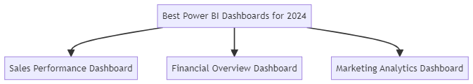
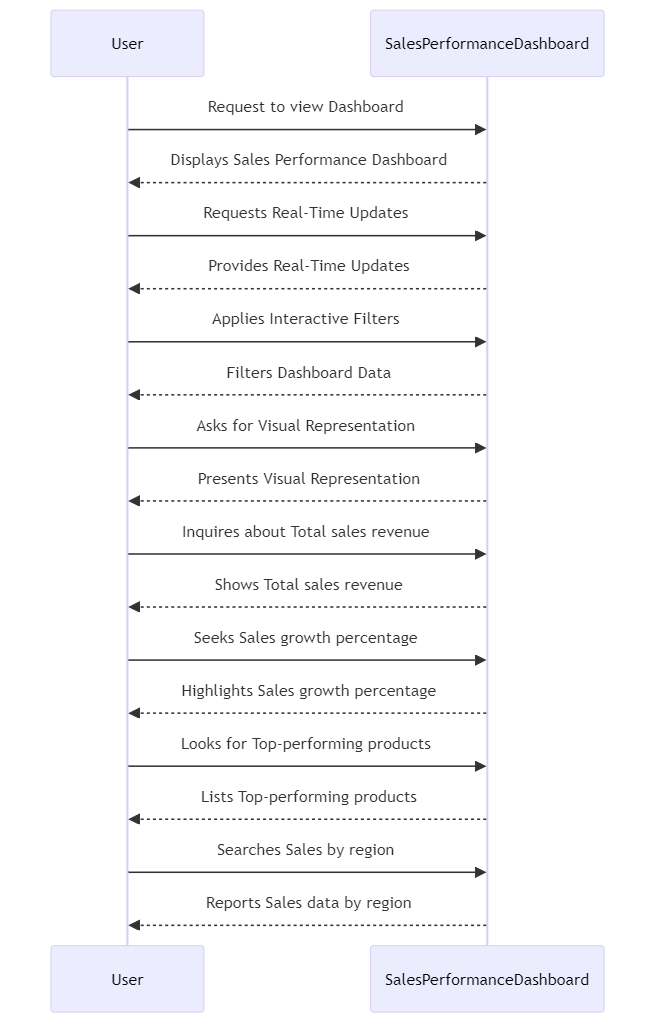
This dashboard overviews sales performance metrics, including total sales, sales by region, product performance, and sales trends over time.
Standout Features:
Real-Time Updates: Automatically refreshes data to provide the most current sales information.
Interactive Filters: Users can filter data by region, product category, and sales period.
Visual Representation: Utilizes bar charts, line graphs, and pie charts to present data in an easily digestible format.
Key Performance Indicators (KPIs) Tracked:
Total sales revenue
Sales growth percentage
Top-performing products
Sales by region
Financial Overview Dashboard
Description:
This dashboard consolidates key financial metrics such as revenue, expenses, profit margins, and cash flow.
Standout Features:
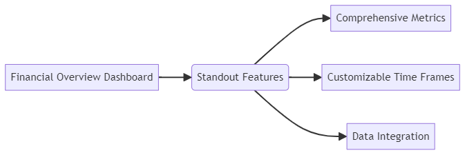
Comprehensive Metrics: Covers a wide range of financial data points for a holistic view of financial health.
Customizable Time Frames: Users can view data across different time periods (monthly, quarterly, yearly).
Data Integration: Pulls data from various financial systems for a unified view.
Key Performance Indicators (KPIs) Tracked:
Total revenue
Net profit margin
Operating expenses
Cash flow analysis
Marketing Analytics Dashboard
Description:
This dashboard provides insights into marketing campaign performance, customer engagement, and lead generation metrics.
Standout Features:
Campaign Performance Tracking: Visualizes the success of various marketing campaigns.
Customer Segmentation: Provides insights into different customer segments and their behaviors.
Engagement Metrics: Tracks metrics such as click-through rates, conversion rates, and social media engagement.
Key Performance Indicators (KPIs) Tracked:
Campaign ROI
Lead conversion rate
Customer acquisition cost
Social media engagement metrics
Trends in Power BI Dashboard Design
Emerging Design Best Practices
Simplified Layouts: Modern dashboards are moving towards cleaner, less cluttered layouts that focus on essential data points. Simplified designs help users quickly find and interpret the information they need without being overwhelmed.
Consistent Color Schemes: Utilizing consistent color palettes not only enhances aesthetic appeal but also aids in user comprehension by establishing visual hierarchies and distinctions between different data sets.
Responsive Design: Ensuring dashboards are optimized for various devices, including desktops, tablets, and smartphones, to provide a seamless user experience across platforms.
Focus on User-Friendly Interfaces and Interactive Dashboards
Intuitive Navigation: Designing dashboards with intuitive navigation elements, such as clear labels, buttons, and drill-down capabilities, makes it easier for users to explore data.
Interactive Elements: Incorporating interactive elements like slicers, filters, and hover-over tooltips enhances user engagement and allows for more in-depth data exploration. These features enable users to customize their views and analyze data from different perspectives.
Personalization: Allowing users to personalize their dashboards according to their preferences and needs, such as saving custom views and setting personal alerts, enhances usability and relevance.
Innovations in Visual Analytics Techniques
Advanced Visualizations: Leveraging advanced visualization techniques such as heat maps, treemaps, and scatter plots to represent complex data in more insightful ways.
AI and Machine Learning Integration: Integrating AI and machine learning capabilities to provide predictive analytics, anomaly detection, and automated insights, helping users make proactive decisions.
Storytelling with Data: Using data storytelling techniques to create a narrative around the data, making it more compelling and easier to understand. This involves combining text, visuals, and interactive elements to guide the user through the data and highlight key insights.
Enhanced Collaboration Features: Adding features that enable better collaboration, such as sharing options, comment sections, and the ability to create and distribute report versions for team-wide analysis and discussion.
In conclusion, the best Power BI dashboards for 2024 are characterized by their ability to present critical data in a clear, interactive, and engaging manner. By following emerging design best practices, focusing on user-friendly interfaces, and incorporating innovative visual analytics techniques, organizations can create dashboards that not only inform but also drive strategic decision-making.
Section 3: Key Features of Effective Power BI Dashboards
Creating effective Power BI dashboards involves incorporating key features that enhance data visualization and analysis. Some of these features include interactive visuals, responsive design, and integration of diverse data sources. Interactive visuals enable users to explore data and gain insights through interactive elements like slicers and filters.
A responsive design ensures seamless viewing on various devices, maintaining consistency and functionality. Integration of diverse data sources allows for comprehensive and holistic analysis, enhancing the overall quality of the dashboard. By incorporating these key features, Power BI dashboards become powerful tools that drive informed decision-making.
Data Visualization Tools
Overview of the Tools Available in Power BI for Creating Impactful Visuals:
Charts and Graphs:
Bar and Column Charts: Ideal for comparing data across categories.
Line Charts: Useful for showing trends over time.
Pie and Donut Charts: Effective for displaying proportions and percentages.
Scatter and Bubble Charts: Great for showing relationships and distributions between two variables.
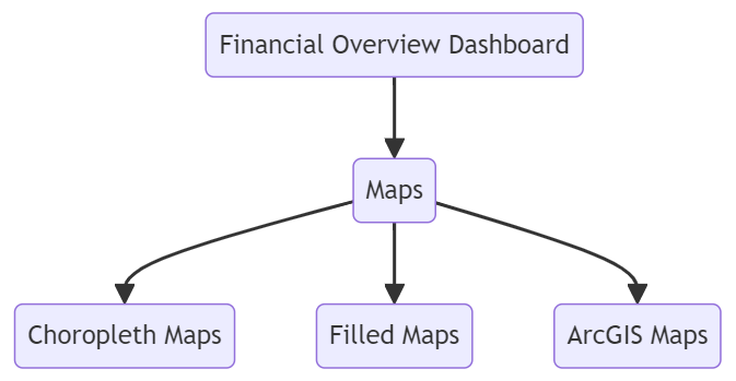
Maps:
Choropleth Maps: Useful for displaying data across geographical regions.
Filled Maps: Highlight specific areas on a map with color-coded data.
ArcGIS Maps: Advanced mapping capabilities for detailed geographical analysis.
Tables and Matrices:
Tables: Display data in a structured tabular format.
Matrices: Provide a pivot-table-like view for multi-dimensional data analysis.
Custom Visuals:
Power BI allows the integration of custom visuals created by the user or available from the Power BI marketplace, enabling highly specialized data presentations.
Gauge and KPI Visuals:
Gauge Charts: Show progress towards a goal.
KPI Visuals: Highlight key performance indicators in an easy-to-understand format.
How These Tools Enhance Data Interpretation:
Clarity and Precision: Visual tools transform raw data into clear, precise visuals that are easier to understand and interpret.
Trend Analysis: Line charts and trend lines in various charts help identify patterns and trends over time, aiding in forecasting and strategic planning.
Comparison and Ranking: Bar charts and tables make it simple to compare performance across categories and rank items based on key metrics.
Geospatial Analysis: Maps provide geographical context to data, which is particularly useful for regional performance analysis and location-based decision-making.
Insight Discovery: Interactive visuals allow users to drill down into data, uncovering deeper insights and connections that might not be evident in static reports.
Performance Metrics Tracking
Importance of Tracking Performance Metrics:
Goal Alignment: Performance metrics help ensure that activities and outcomes are aligned with organizational goals and objectives.
Performance Monitoring: Continuous tracking of KPIs enables organizations to monitor performance, identify areas of improvement, and make data-driven adjustments.
Accountability: Clear metrics create accountability by defining specific, measurable outcomes for teams and individuals.
Informed Decision-Making: Metrics provide a factual basis for making informed business decisions, minimizing guesswork and intuition.
Examples of Critical KPIs in Various Industries:
Retail:
Sales Revenue: Total revenue generated from sales.
Conversion Rate: Percentage of visitors who make a purchase.
Customer Lifetime Value (CLTV): Predicted revenue from a customer over the entire relationship.
Inventory Turnover: How often inventory is sold and replaced over a period.
Finance:
Net Profit Margin: Percentage of revenue that remains as profit after expenses.
Return on Investment (ROI): Profitability of investments.
Operating Expenses: Total expenses incurred during normal business operations.
Debt-to-Equity Ratio: Measure of a company's financial leverage.
Healthcare:
Patient Satisfaction Score: Measure of patients' overall satisfaction with services.
Average Length of Stay: Average number of days patients stay in a hospital.
Readmission Rate: Percentage of patients readmitted after discharge.
Treatment Success Rate: Percentage of patients successfully treated.
Interactive Dashboards
Features That Enable User Interactivity:
Slicers and Filters: Allow users to filter data by different criteria, such as date ranges, categories, or geographical areas, providing a personalized view of the data.
Drill-Through and Drill-Down: Enable users to click on a data point to see more detailed information or navigate to related reports and dashboards.
Hover-Over Tooltips: Display additional data when users hover over a visual element, offering more context without cluttering the dashboard.
Bookmarks: Save specific views of the dashboard that users can quickly return to, facilitating easy exploration of different data scenarios.
Customizable Visuals: Allow users to change the type, format, and layout of visuals to suit their specific needs and preferences.
Benefits of Interactive Elements in Dashboards:
Enhanced User Engagement: Interactive elements make dashboards more engaging and enjoyable to use, encouraging users to explore and interact with the data.
Deeper Insights: Interactivity allows users to drill down into the data, uncovering deeper insights that static reports might miss.
Personalization: Users can tailor their views to focus on the data that matters most to them, enhancing the relevance and utility of the dashboard.
Efficient Analysis: Interactive features like slicers and filters enable quick data exploration and analysis, saving time and improving productivity.
Better Decision-Making: By providing dynamic, real-time access to data and insights, interactive dashboards support more informed and timely decision-making.
In conclusion, effective Power BI dashboards leverage powerful data visualization tools, track essential performance metrics, and include interactive elements to enhance user engagement and data analysis. By incorporating these features, organizations can create dashboards that not only present data clearly but also provide valuable insights that drive better business outcomes.
Section 4: Building Customizable and User-friendly Dashboards
Customizable and user-friendly dashboards are essential for businesses seeking to empower their users with valuable insights. These dashboards allow for a personalized experience, providing users with the information they need in a format that is easy for them to understand.
By building customizable and user-friendly dashboards, businesses can enhance user satisfaction, increase productivity, and pave the way for better decision-making. With the help of intuitive design and interactive features, businesses can ensure that their dashboards are effective tools that drive success in today’s competitive market.
Steps to Create Reports Tailored to Specific Business Needs:
Identify Business Objectives:
Clearly define the goals and objectives of the report. Understand what insights and data are crucial for decision-making.
Gather Requirements:
Engage with stakeholders to gather detailed requirements. Determine which data sources, metrics, and visualizations are needed.
Choose the Right Data Sources:
Connect Power BI to the necessary data sources. Ensure that the data is accurate, relevant, and up-to-date.
Design the Report Layout:
Plan the report layout based on user requirements. Use a logical structure that prioritizes key information and provides a clear flow.
Select Appropriate Visualizations:
Choose visualizations that best represent the data and support the report's objectives. Ensure that the visuals are easy to interpret.
Add Interactivity:
Incorporate interactive elements like slicers, filters, and drill-down capabilities to enhance user engagement and allow for deeper data exploration.
Apply Consistent Formatting:
Use consistent color schemes, fonts, and formatting to create a cohesive and professional-looking report.
Test and Validate:
Review the report for accuracy and completeness. Test the interactivity and ensure that all elements work as intended.
Iterate Based on Feedback:
Gather feedback from stakeholders and users. Make necessary adjustments to improve the report's effectiveness and usability.
Deploy and Monitor:
Publish the report to Power BI Service. Monitor its usage and performance, and update it regularly to reflect new data and insights.
Examples of Customizable Reports in Different Scenarios:
Sales Performance Report:
Objective: Track sales metrics and performance across regions and products.
Visualizations: Bar charts for regional sales, pie charts for product categories, and line graphs for sales trends.
Interactive Elements: Filters for regions, time periods, and product categories; drill down into specific sales reps’ performance.
Financial Analysis Report:
Objective: Provide an overview of financial health, including revenue, expenses, and profit margins.
Visualizations: Gauge charts for KPIs, waterfall charts for profit margins, and tables for detailed financial data.
Interactive Elements: Slicers for time periods (monthly, quarterly, yearly), drill-through to detailed expense reports.
Customer Engagement Report:
Objective: Analyze customer interactions and engagement across various channels.
Visualizations: Heat maps for customer locations, line graphs for engagement trends, and bar charts for channel performance.
Interactive Elements: Filters for customer segments, channels, and engagement types; hover-over tooltips with additional details.
User-friendly Interfaces
Principles of Designing Intuitive and Accessible Dashboards:
Simplicity and Clarity:
Keep the design simple and uncluttered. Focus on displaying the most important information clearly and concisely.
Consistency:
Use consistent design elements, such as colors, fonts, and visual styles, to create a cohesive look and feel.
Logical Layout:
Arrange visualizations in a logical order that guides the user through the data. Place the most critical information at the top or in prominent positions.
Accessibility:
Ensure that the dashboard is accessible to all users, including those with disabilities. Use high-contrast colors, and readable fonts, and provide alternative text for visuals.
Responsiveness:
Design the dashboard to be responsive, ensuring it looks good and functions well on different devices, including desktops, tablets, and smartphones.
Interactive and Engaging:
Incorporate interactive elements that allow users to explore the data. Use engaging visuals and animations sparingly to maintain user interest without overwhelming them.
User Feedback:
Provide mechanisms for users to give feedback on the dashboard. Use this feedback to make continuous improvements and enhancements.
Case Studies of User-friendly Dashboard Implementations:
Retail Chain Dashboard:
Objective: Provide store managers with real-time sales and inventory data.
Features:
Simplified Layout: Clean and uncluttered design focusing on key metrics like daily sales, top-selling products, and stock levels.
Interactive Filters: Easy-to-use filters for selecting different stores, regions, and time periods.
Mobile Accessibility: Responsive design ensuring the dashboard is usable on tablets and smartphones.
Outcome: Improved decision-making and operational efficiency at the store level, leading to increased sales and better inventory management.
Healthcare Provider Dashboard:
Objective: Track patient outcomes and operational metrics for healthcare administrators.
Features:
Logical Layout: Key metrics like patient satisfaction, average length of stay, and readmission rates are prominently displayed.
Accessibility: High-contrast color scheme and readable fonts for accessibility.
Interactive Elements: Drill-down capabilities to explore patient data by department, diagnosis, and treatment type.
Outcome: Enhanced ability to monitor and improve patient care quality, leading to higher patient satisfaction and better resource allocation.
Financial Services Dashboard:
Objective: Provide financial analysts with a comprehensive view of investment performance.
Features:
Consistent Design: Consistent use of colors and fonts to differentiate between various asset classes and performance metrics.
Real-time Data: Integration with live data sources for up-to-date information.
User Feedback: Incorporated user feedback mechanisms to continuously improve the dashboard based on analyst needs.
Outcome: More accurate and timely investment decisions, leading to improved portfolio performance and client satisfaction.
In summary, building customizable and user-friendly Power BI dashboards involves creating tailored reports that meet specific business needs and designing interfaces that are intuitive and accessible. By following best practices and learning from successful implementations, organizations can develop dashboards that effectively communicate data insights and drive better business outcomes.
Take your Power BI dashboards to the next level with these advanced techniques. From custom visualizations to advanced DAX formulas, there are endless possibilities to enhance your data storytelling. With these techniques in your toolkit, you’ll be able to create truly dynamic and impactful dashboards that make a lasting impression on your audience.
Keep pushing the boundaries of what’s possible with Power BI and watch your insights soar to new heights. Elevate your data visualization game and stay ahead of the competition with these advanced Power BI techniques.
Real-time Data Analysis
Methods for Integrating Real-time Data Feeds:
DirectQuery:
Connects directly to the data source, allowing for real-time data retrieval whenever the dashboard is accessed. Ideal for large databases and real-time data requirements.
Streaming Datasets:
Power BI supports streaming datasets that push data to the dashboard in real-time. These datasets can be created using Azure Stream Analytics, Microsoft Flow, or Power BI REST API.
Azure Stream Analytics:
A service that processes real-time data streams from multiple sources and outputs the data to Power BI for real-time visualization. It integrates seamlessly with IoT devices, social media feeds, and other streaming data sources.
Power BI REST API:
Allows developers to push real-time data directly to Power BI dashboards. This method provides flexibility in how data is ingested and visualized.
Event Hubs and Data Lakes:
Utilize Azure Event Hubs and Data Lakes to collect and process large volumes of real-time data. This processed data can then be fed into Power BI for real-time analysis.
Benefits and Challenges of Real-time Analysis:
Benefits:
Immediate Insights: Provides up-to-the-minute data, enabling faster and more informed decision-making.
Operational Efficiency: Allows organizations to respond quickly to changing conditions, such as inventory levels, market trends, or operational issues.
Enhanced Monitoring: Real-time dashboards can monitor critical metrics continuously, alerting users to potential issues as they arise.
Competitive Advantage: Real-time data analysis can give businesses a competitive edge by allowing them to act on insights faster than their competitors.
Challenges:
Data Quality: Ensuring the accuracy and consistency of real-time data can be challenging, as it often comes from multiple sources.
Performance: Real-time data processing can be resource-intensive, potentially impacting system performance if not managed properly.
Complexity: Setting up and maintaining real-time data feeds requires technical expertise and can be complex to implement.
Scalability: Handling large volumes of real-time data and ensuring scalability can be difficult, particularly for organizations with rapidly growing data needs.
Visual Analytics Techniques
Advanced Techniques for Visualizing Complex Data:
Heat Maps:
Use color gradients to represent data density and distribution. Ideal for geographic data or to highlight areas of concentration within large datasets.
Tree Maps:
Display hierarchical data as nested rectangles, providing a visual representation of the data structure and relative sizes.
Sankey Diagrams:
Visualize flow and relationships between different entities. Useful for understanding data flows and connections.
Advanced mapping capabilities are provided by ArcGIS, which includes rich geographical data and sophisticated spatial analysis tools.
Advanced DAX (Data Analysis Expressions):
Use DAX to create complex calculations and custom metrics, enhancing the analytical capabilities of Power BI dashboards.
Custom Visuals:
Develop or integrate third-party custom visuals tailored to specific business needs, expanding the range of visualization options.
Tools and Features in Power BI That Support These Techniques:
Custom Visuals Marketplace:
Power BI’s marketplace offers a variety of custom visuals that users can download and incorporate into their dashboards. This includes specialized visuals like Gantt charts, radar charts, and more.
Bookmarks and Selection Pane:
Use bookmarks to create and navigate between different views of the dashboard. The selection pane allows for managing the visibility of visuals, aiding in creating interactive reports.
Power BI Service and Premium:
Provides enhanced performance, greater capacity, and advanced features such as AI-driven analytics, paginated reports, and dataflows.
Dataflows:
Power BI dataflows enable users to unify data from disparate sources and prepare it for analysis. This is particularly useful for complex data transformations and integrations.
Report Themes:
Customize the appearance of dashboards with report themes, which standardize colors, fonts, and layout across all visuals, enhancing the overall aesthetic and user experience.
AI Visuals:
Incorporate AI-driven visuals like Key Influencers and Decomposition Tree to uncover insights and patterns in the data automatically.
In conclusion, advanced techniques in Power BI dashboards, such as real-time data analysis and sophisticated visual analytics, provide powerful tools for organizations to gain deeper insights and respond swiftly to changing conditions. By leveraging the rich features and tools available in Power BI, users can create highly effective and visually compelling dashboards that drive data-driven decision-making.
Section 6: Integration and Scalability
Data Integration Solutions
Integrating Various Data Sources into Power BI:
Connecting to Different Data Sources:
Databases: Integrate with SQL Server, Oracle, MySQL, PostgreSQL, and other relational databases.
Cloud Services: Connect to cloud data sources like Azure SQL Database, Google BigQuery, Amazon Redshift, and others.
APIs and Web Services: Use REST APIs and web services to pull data from various applications and online platforms.
Flat Files: Import data from CSV, Excel, and text files for analysis.
On-Premises Data Gateway: Use this gateway to securely connect on-premises data sources with Power BI Service.
Third-Party Applications: Connect to popular business applications like Salesforce, Dynamics 365, Google Analytics, and more through native connectors.
Data Preparation and Transformation:
Power Query Editor: Use Power Query to clean, transform, and prepare data for analysis. This includes merging datasets, removing duplicates, and reshaping data.
Dataflows: Create reusable dataflows for consistent data transformation and integration across multiple reports and dashboards.
Combining Data from Multiple Sources:
Merging and Appending Queries: Combine data from different sources by merging (joining tables based on common columns) or appending (stacking data from different tables).
Data Modeling: Create relationships between different tables in the Power BI data model to enable integrated analysis.
Real-time Data Integration:
Streaming Data: Use streaming datasets and Azure Stream Analytics for real-time data integration and visualization.
Scheduled Refresh: Set up automatic data refresh schedules to keep dashboards up-to-date with the latest information.
Case Studies of Successful Data Integration:
Retail Company:
Challenge: Integrate sales data from multiple regional databases and online sales platforms.
Solution: Used Power BI to connect to regional SQL Server databases and APIs from e-commerce platforms. Combined data through Power Query for unified reporting.
Outcome: Provided a comprehensive view of global sales performance, enabling better inventory management and sales forecasting.
Healthcare Provider:
Challenge: Consolidate patient data from electronic health records (EHR), lab systems, and patient feedback surveys.
Solution: Leveraged Power BI's on-premises data gateway to connect to EHR databases and integrated survey data through APIs. Used dataflows for consistent data preparation.
Outcome: Created integrated dashboards that enhanced patient care quality and operational efficiency by providing holistic insights.
Financial Services Firm:
Challenge: Integrate financial data from multiple sources, including on-premises databases, cloud-based accounting systems, and market data feeds.
Solution: Utilized Power BI’s native connectors to link on-premises and cloud data sources. Applied Power Query transformations to standardize data formats.
Elastic Resources: Cloud platforms offer elastic resources, allowing organizations to scale up or down based on demand without significant infrastructure investments.
Global Accessibility: Users can access BI tools and dashboards from anywhere, ensuring that remote and distributed teams can collaborate effectively.
Cost Efficiency:
Pay-as-You-Go: Cloud services often follow a pay-as-you-go pricing model, reducing upfront costs and allowing businesses to pay only for the resources they use.
Reduced Maintenance: Cloud providers manage infrastructure maintenance, updates, and security, freeing up internal IT resources.
Security and Compliance:
Data Security: Leading cloud providers offer robust security measures, including data encryption, access controls, and regular security audits.
Compliance: Cloud BI solutions comply with various industry standards and regulations, ensuring data privacy and protection.
Flexibility and Innovation:
Continuous Updates: Cloud BI platforms frequently update with new features and capabilities, ensuring that users have access to the latest tools and innovations.
Integration Capabilities: Cloud BI solutions easily integrate with other cloud services and applications, fostering a seamless data ecosystem.
How Power BI Leverages Cloud Technology for Scalability:
Power BI Service:
The Power BI Service (Power BI Online) leverages Microsoft Azure to provide scalable, cloud-based analytics. Users can publish, share, and collaborate on reports and dashboards securely in the cloud.
Auto-Scaling:
Power BI’s cloud infrastructure automatically scales to handle varying workloads, ensuring optimal performance during peak usage times without manual intervention.
Data Storage and Management:
Azure Data Lake Storage: Power BI integrates with Azure Data Lake Storage for scalable data storage and advanced data processing capabilities.
Azure Synapse Analytics: Combines big data and data warehousing to provide scalable and integrated analytics solutions.
Real-time Analytics:
Power BI supports real-time data streaming and processing through integration with Azure Stream Analytics, enabling real-time insights and monitoring.
Enterprise Features:
Power BI Premium: Offers dedicated cloud resources for large-scale deployments, ensuring high performance and capacity for enterprise users.
Power BI Embedded: Allows developers to embed fully interactive Power BI reports and dashboards into custom applications, providing scalable analytics solutions for external users.
Collaborative Workspaces:
Cloud-based workspaces in Power BI enable teams to collaborate on reports and dashboards in real time, ensuring consistency and version control.
In summary, effective data integration and the advantages of cloud-based business intelligence are key factors in maximizing the scalability and impact of Power BI dashboards. By leveraging robust data integration solutions and cloud technologies, organizations can create powerful, scalable BI solutions that drive informed decision-making and support business growth.
When it comes to creating effective dashboards, following best practices is crucial. By adhering to key principles, such as ensuring data relevance, utilizing proper visualization types, and maintaining consistency in design, you can enhance the user experience and ultimately drive better decision-making.
Additionally, understanding and avoiding common pitfalls in dashboard design, like cluttered layouts and excessive use of colors, can help streamline the process and optimize your dashboard’s efficiency. Utilizing enterprise reporting tools that offer advanced features and customization options can also elevate the overall quality of your dashboard, making data analysis easier and more impactful.
Dashboard Design Best Practices
Key Principles for Designing Effective Dashboards:
Clarity and Simplicity:
Minimalism: Keep the design simple and uncluttered. Focus on the essential data and remove any unnecessary elements.
Clear Visual Hierarchy: Arrange information logically, with the most important data prominently displayed. Use size, color, and placement to guide the viewer’s attention.
Consistent Design:
Standardized Colors and Fonts: Use a consistent color scheme and font style throughout the dashboard to create a cohesive look.
Uniform Visuals: Ensure that similar types of data are represented with consistent visual elements (e.g., all sales figures using bar charts).
Actionable Insights:
Focus on Key Metrics: Highlight key performance indicators (KPIs) and metrics that are critical for decision-making.
Contextual Information: Provide context for data points, such as benchmarks, targets, and historical comparisons.
User-centric Design:
Understand Your Audience: Design the dashboard with the end-user in mind. Consider their needs, preferences, and the decisions they need to make.
Intuitive Navigation: Ensure that the dashboard is easy to navigate. Use clear labels, tooltips, and interactive elements to enhance usability.
Interactive Elements:
Drill-down Capabilities: Allow users to explore data in more detail through drill-down and drill-through features.
Dynamic Filters: Use slicers and filters to enable users to customize their view and focus on specific subsets of data.
Performance Optimization:
Efficient Data Queries: Optimize data queries to ensure fast loading times and smooth interactivity.
Responsive Design: Ensure the dashboard performs well on different devices and screen sizes.
Regular Updates and Maintenance:
Keep Data Fresh: Regularly update the dashboard with the latest data to maintain its relevance.
User Feedback: Continuously gather user feedback and make improvements based on their input.
Common Pitfalls to Avoid in Dashboard Design:
Overloading with Information:
Avoid cramming too much data onto a single dashboard. This can overwhelm users and make it difficult to extract meaningful insights.
Ignoring Data Quality:
Ensure that the data feeding into the dashboard is accurate, clean, and consistent. Poor data quality can lead to incorrect conclusions and decisions.
Inconsistent Design:
Avoid using inconsistent colors, fonts, and visual styles, as this can confuse users and detract from the dashboard’s effectiveness.
Lack of Context:
Don’t present data without providing context, such as benchmarks, historical data, or explanatory notes. Users need context to understand the significance of the data.
Overcomplicating Interactivity:
While interactivity is important, overly complex interactive elements can frustrate users. Ensure that interactive features are intuitive and easy to use.
Ignoring User Experience:
Focusing solely on data visualization without considering user experience can lead to ineffective dashboards. Always design with the end-user in mind.
Enterprise Reporting Tools
Overview of Tools and Features for Enterprise-level Reporting:
Power BI Premium:
Provides dedicated cloud resources for large-scale deployments, ensuring high performance and capacity.
Offers advanced features such as paginated reports, dataflows, and AI-driven analytics.
Tableau:
Known for its powerful data visualization capabilities and ease of use.
Supports large-scale data analysis and offers robust integration with various data sources.
SAP BusinessObjects:
Comprehensive suite for enterprise reporting, analysis, and data visualization.
Integrates seamlessly with SAP ERP systems and supports complex reporting needs.
IBM Cognos Analytics:
Offers advanced reporting, analytics, and dashboarding capabilities.
Supports natural language querying and AI-driven insights.
Oracle Analytics Cloud:
Provides a complete analytics solution with data preparation, visualization, and reporting tools.
Leverages Oracle’s cloud infrastructure for scalability and performance.
Qlik Sense:
Features an associative data model that allows for flexible and interactive data exploration.
Supports large-scale deployments and provides robust security features.
Examples of Enterprise Reporting Dashboards:
Financial Performance Dashboard:
Objective: Provide executives with a comprehensive view of the organization’s financial health.
Features:
Key financial metrics such as revenue, profit margins, and expenses.
Trend analysis with historical data comparisons.
Interactive filters to view performance by department, region, or product line.
Sales metrics such as total sales, average deal size, and conversion rates.
Marketing KPIs include campaign ROI, lead generation, and customer acquisition cost.
Real-time updates and interactive drill-downs to explore data at various levels.
Operational Efficiency Dashboard:
Objective: Monitor operational performance and identify areas for improvement.
Features:
Metrics such as production efficiency, downtime, and defect rates.
Heat maps and flow charts to visualize operational bottlenecks.
Alerts and notifications for critical issues requiring immediate attention.
Customer Experience Dashboard:
Objective: Measure customer satisfaction and engagement levels.
Features:
Customer feedback scores, Net Promoter Score (NPS), and support ticket resolution times.
Interactive elements to segment data by customer demographics or service channels.
Trend analysis to identify patterns and areas for improvement.
In summary, adhering to best practices in dashboard design and leveraging powerful enterprise reporting tools can significantly enhance the effectiveness of business intelligence solutions. By focusing on clarity, consistency, and user-centric design, organizations can create dashboards that provide actionable insights and drive data-driven decision-making.
Conclusion
This article summarizes Power BI dashboards' importance in business intelligence, covering key aspects like their dynamic nature and real-time insights. It showcases the best dashboards for 2024, emphasizing design and functionality trends.
Effective dashboards feature essential tools for data visualization, performance tracking, and user interactivity. The article outlines steps for creating customizable, user-friendly dashboards and explores advanced techniques for data analysis. It highlights the benefits of integration and cloud scalability while providing best design practices.
Looking ahead, Power BI dashboards will increasingly incorporate AI, real-time data, customization, improved user experiences, and cloud solutions. Users are encouraged to implement best practices and explore advanced techniques to enhance decision-making and business performance.
Additional Resources
Links to Tutorials, Templates, and Additional Reading Materials:
At Infiniticube, we recognize the critical role that advanced analytics and data visualization play in modern business success. That's why we offer a free consultation to help you harness the full potential of Power BI.
Our expert consultants will collaborate with you to understand your unique needs, demonstrate best practices in dashboard design, and provide tailored solutions for real-time data analysis, performance metrics tracking, and interactive reporting.
He is working with infiniticube as a Digital Marketing Specialist. He has over 3 years of experience in Digital Marketing. He worked on multiple challenging assignments.
Our newsletter is finely tuned to your interests, offering insights into AI-powered solutions, blockchain advancements, and more. Subscribe now to stay informed and at the forefront of industry developments.


 June 27, 2025
 Balbir Kumar Singh
 0
0


Leave a Reply