The importance of depth and perspective in modern web design trends emphasizes how these elements enhance user experience. Depth and perspective create visual hierarchy, engagement, intuitiveness, and aesthetic appeal, increasing user interaction and brand differentiation.
The guide aims to help designers master lighting, shadows, textures, colors, composition, scale, motion, layers, and advanced tools to effectively achieve depth and perspective in web design, resulting in dynamic and engaging websites with superior usability and user experience.
By the end of this guide, you will have a comprehensive understanding of how to incorporate depth and perspective into your web design projects, enhancing both the visual appeal and user experience of your websites.
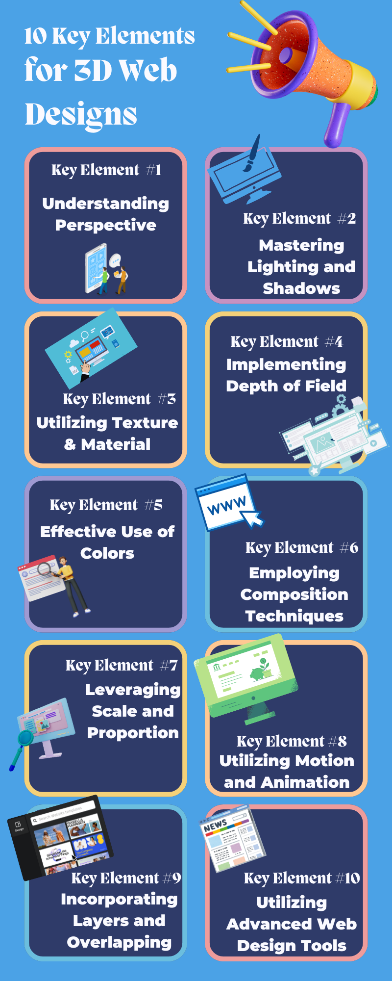
Key Element 1: Understanding the Perspective of 3D Web Designs
Definition and Types of Perspective
Linear Perspective in Web Design
Linear perspective is a technique that creates the illusion of depth on a flat surface. It involves representing objects smaller as they get further away from the viewer, converging towards a single point known as the vanishing point. In web design, linear perspective can create a sense of three-dimensionality, making elements appear as if they are receding into the distance or popping out toward the viewer.
There are three main types of linear perspective used in web design:
1. One-Point Perspective: This involves a single vanishing point on the horizon line. It’s often used to draw the viewer's eye to the center of the screen, creating a tunnel-like effect. This perspective is useful for focusing on central elements such as a hero image or a call-to-action button.
2. Two-Point Perspective: This uses two vanishing points on the horizon line, creating a more dynamic and realistic sense of space. It’s often employed in designs that aim to give a sense of depth from multiple angles, such as a room or a 3D object rotating in space.
3. Three-Point Perspective: This involves three vanishing points, two on the horizon and one either above or below the horizon line. It’s used for creating dramatic and complex perspectives, such as towering structures or deep pits. This type of perspective is less common but can be very effective for certain web design elements.
How Perspective Guides User Navigation
Perspective is not just about creating a visually appealing design; it also plays a critical role in guiding user navigation. By using perspective, designers can:
Direct User Attention: Elements placed along the lines of perspective naturally draw the user’s eye toward key areas of the page. For example, a path or road leading to a focal point can guide users to important content or calls to action.
Create a Sense of Flow: Perspective can create a visual flow that makes navigating a website more intuitive. Users can follow visual cues and pathways that lead them through the content logically and engagingly.
Enhance Usability: By providing visual depth, perspective helps users understand the spatial relationships between different elements on the page, making it easier to interact with them.
Application in Web Design
Examples of Perspective Use in Web Interfaces
1. Hero Sections: Many websites use a one-point perspective in hero sections to draw the user’s attention to the center of the screen. For example, a road or pathway leading to a central logo or call-to-action button can create a strong visual impact.
2. Product Showcases: E-commerce sites often use a two-point perspective to showcase products in a three-dimensional space. This technique makes products appear more tangible and appealing, encouraging users to explore them further.
3. Interactive Elements: Websites with interactive features, such as games or virtual tours, frequently use a three-point perspective to create immersive environments. This type of perspective can make the user feel more engaged and connected to the content.
Practical Tips for Incorporating Perspective
1. Start with a Grid: Use a perspective grid as a foundation for your design. This will help you accurately place elements in a way that creates a sense of depth.
2. Use Gradients and Shadows: Gradients can create the illusion of light and shadow, adding to the depth. Similarly, drop shadows and inner shadows can make elements appear to float or recede.
3. Employ CSS Transformations: CSS properties like `transform: perspective()`, `rotate()`, and `scale()` can be used to manipulate elements in 3D space. Experiment with these properties to achieve the desired perspective effect.
4. Leverage Parallax Scrolling: Parallax scrolling is a technique where background images move slower than foreground images, creating a sense of depth as the user scrolls. This can be particularly effective for storytelling and immersive experiences.
5. Test for Usability: While perspective can enhance visual appeal, it’s important to ensure that it doesn’t compromise usability. Test your design with real users to make sure that perspective elements guide navigation effectively without confusion.
Understanding and effectively applying perspective in web design can create more engaging, intuitive, and visually appealing websites. This not only enhances the user experience but also helps achieve your design goals more effectively.
Key Element 2: Mastering Lighting and Shadows
Role of Lighting in 3D Web Design
Simulating Lighting Effects in a Digital Space
Lighting is a powerful tool in web design, playing a crucial role in creating depth, enhancing visual hierarchy, and guiding user attention. By simulating realistic lighting effects, designers can make digital elements appear more tangible and engaging.
1. Creating Focus and Emphasis: Just as in photography or film, lighting in web design can be used to highlight important elements. Brightly lit areas draw the user’s eye, making key content stand out.
2. Enhancing Mood and Atmosphere: The color and intensity of light can influence the mood of a web page. Warm lighting creates a cozy, inviting feel, while cooler lighting can make a site feel more modern and professional.
3. Defining Spatial Relationships: Proper use of lighting can define the spatial relationships between elements, making some appear closer and others further away. This helps in establishing a visual hierarchy and improves the overall readability of the page.
4. Adding Realism: Simulating natural lighting conditions, such as sunlight, artificial light, or even reflections, adds a level of realism that can make a web design feel more immersive and engaging.
Creating Realistic Shadows
Techniques for Shadow Casting in CSS
Shadows are essential for creating the illusion of depth and layering in web design. When used effectively, shadows can make elements appear as though they are floating above the background or recessed into the page.
1. Box Shadow: The `box-shadow` property in CSS is a versatile tool for adding shadows to elements. It allows you to define the offset, blur radius, spread radius, and color of the shadow.
```css
.example {
box-shadow: 10px 10px 20px rgba(0, 0, 0, 0.2);
}
```
2. Text Shadow: The `text-shadow` property adds depth to the text, making it stand out against the background. This can be particularly useful for headings or other important text elements.
```css
.headline {
text-shadow: 2px 2px 4px rgba(0, 0, 0, 0.3);
}
```
3. Layered Shadows: Creating multiple layers of shadows can add complexity and realism. For instance, using both an inner shadow (`inset`) and an outer shadow can give an element a more three-dimensional appearance.
4. Soft and Hard Shadows: Adjusting the blur radius can change the nature of the shadow. Soft shadows (with a higher blur radius) create a more diffuse light effect, while hard shadows (with a lower blur radius) suggest a stronger, direct light source.
```css
.soft-shadow {
box-shadow: 0 10px 30px rgba(0, 0, 0, 0.1);
}
.hard-shadow {
box-shadow: 0 5px 5px rgba(0, 0, 0, 0.5);
}
```
Impact of Light and Shadow on Depth Perception
Lighting and shadows significantly affect how users perceive depth and spatial relationships on a web page:
1. Creating Layers: Shadows can be used to create distinct layers in the design. Elements with shadows appear to float above the background, creating a sense of layering that adds depth.
2. Enhancing Visual Hierarchy: By varying the intensity and position of shadows, designers can establish a clear visual hierarchy. More prominent shadows can make certain elements stand out more, guiding the user’s eye to important areas of the page.
3. Improving Usability: Realistic shadows help users understand the interactive potential of elements. For instance, buttons with subtle shadows appear clickable, while input fields with inner shadows look recessed, indicating where users should type.
4. Adding Realism and Immersion: Shadows that mimic natural light conditions can make a design feel more realistic and immersive. This is particularly effective in creating interfaces that users find visually appealing and engaging.
To master lighting and shadows in web design, it’s important to experiment with different techniques and tools, understanding how various lighting conditions and shadow properties affect the overall look and feel of your design. Through practice and iteration, you can create visually rich and engaging web experiences that effectively utilize depth and perspective.
Key Element 3: Utilizing Texture and Material
Importance of Textures
How Textures Add Realism and Tactile Quality
Textures play a crucial role in web design by adding a sense of realism and tactile quality to digital interfaces. They can transform flat designs into visually rich and engaging experiences. Here’s how textures contribute to the effectiveness of web design:
1. Enhancing Visual Interest: Textures can break the monotony of flat colors and simple shapes, adding visual complexity that makes the design more engaging. Whether subtle or bold, textures draw users' attention and keep them interested.
2. Creating Realism: By mimicking real-world materials like wood, fabric, metal, or paper, textures can make digital elements appear more lifelike. This realism helps users relate to the design, making the interface more intuitive and immersive.
3. Adding Depth: Textures can create the illusion of depth, making elements appear as though they have physical substance. This adds to the three-dimensional feel of the design, enhancing the overall user experience.
4. Improving Tactile Quality: Textures suggest how an element might feel if touched, adding a sensory dimension to the visual experience. This tactile quality can make buttons, backgrounds, and other elements more appealing and engaging.
5. Guiding User Interaction: Textures can also serve functional purposes, such as indicating interactivity. For example, a textured button might appear more clickable, while a textured background can create a sense of separation from interactive elements.
Material Design Principles
Google’s Material Design Guidelines
Google's Material Design is a design language developed to create a consistent and intuitive user experience across different platforms and devices. It focuses on using textures and materials to mimic the physical world, enhancing the digital experience. Key principles include:
1. Material is Metaphor: Material Design uses the concept of "material" as a unifying theory of a rationalized space and a system of motion. This metaphor is grounded in tactile reality, inspired by the study of paper and ink, yet technologically advanced and open to imagination and magic.
2. Bold, Graphic, and Intentional: Material Design emphasizes bold, deliberate, and intentional graphics. The use of edge-to-edge imagery, large-scale typography, and deliberate white space creates a striking interface that focuses on user actions.
3. Motion Provides Meaning: Motion in Material Design is used to create a smooth and coherent flow of interaction, guiding users through the interface. Movement is used to focus attention and maintain continuity, while feedback is subtle yet clear.
Best Practices for Applying Textures and Materials in Web Design
To effectively incorporate textures and materials into web design, consider the following best practices:
1. Use Subtle Textures for Backgrounds: Background textures should be subtle so they don’t overpower the content. Light textures can add depth and interest without distracting from the main elements of the page.
```css
body {
background: url('light-texture.png') repeat;
}
```
2. Highlight Interactive Elements: Apply more pronounced textures to buttons and interactive elements to make them stand out and appear more tactile.
```css
.button {
background: url('button-texture.png') no-repeat center center;
background-size: cover;
}
```
3. Consistent Use of Material: Follow consistent material design principles to maintain a cohesive look and feel. Use similar textures for elements that share the same function or purpose.
4. Balance with Flat Design: While textures add depth, combining them with flat design elements can create a balanced and modern look. Use flat colors for primary areas and textures for accents and highlights.
5. Optimize for Performance: Ensure that textures and images are optimized for web use. Compress files to reduce load times without compromising quality. Use CSS for simple textures to save on load time.
6. Responsive Design: Make sure that textures and material elements adapt well to different screen sizes and resolutions. Test your design on various devices to ensure a consistent experience.
7. Accessibility Considerations: Ensure that textured elements do not hinder readability or usability. Maintain sufficient contrast between textured backgrounds and text to keep content accessible.
By understanding the importance of textures and adhering to material design principles, designers can create more realistic, engaging, and user-friendly web experiences. These elements not only enhance the aesthetic appeal of a website but also contribute to a better overall user experience by making the interface more intuitive and enjoyable to navigate.
Key Element 4: Implementing Depth of Field
Concept of Depth of Field
Mimicking Camera Focus Effects in Web Design
Depth of field (DoF) is a photography and cinematography technique that refers to the range of distance within a shot that appears acceptably sharp and in focus. By controlling the focus, photographers can direct viewers' attention to specific areas of an image while blurring out the rest. This creates a sense of depth and can make the subject stand out against a less distinct background.
In web design, mimicking depth-of-field effects can enhance the visual hierarchy and guide users' attention in a similar way. By blurring certain parts of the interface, designers can create focal points and draw the user's eye to the most important elements. This technique can also add a layer of realism and sophistication to the design.
Application in Web Design
Techniques for Creating Depth-of-Field Effects Using CSS and JavaScript
1. CSS Techniques
CSS Filters: The `filter` property in CSS can be used to apply a blur effect to elements, mimicking a shallow depth of field.
```css
.background {
filter: blur(5px);
}
```
This can be combined with other CSS properties to create a more dynamic effect. For example, you might want to blur the background while keeping the foreground elements in focus:
```css
.foreground {
position: relative;
z-index: 10;
}
.background {
position: absolute;
z-index: 1;
width: 100%;
height: 100%;
filter: blur(5px);
}
```
Opacity and Gradients: Using gradients and varying opacity can also simulate depth of field by gradually transitioning from clear to blurry areas.
Canvas API: For more complex and dynamic effects, the HTML5 Canvas API can be used to create custom blur effects. This allows for more control over the blur radius and can be used to create interactive experiences.
Libraries and Plugins: There are several JavaScript libraries and plugins available that simplify the process of creating depth-of-field effects. Libraries like `three.js` can be used for more advanced 3D rendering, while simpler plugins like `Blur.js` provide easy-to-implement blur effects.
```javascript
$(document).ready(function() {
$('.background').blurjs({
source: '.foreground',
radius: 10,
overlay: 'rgba(255,255,255,0.4)'
});
});
```
Examples and Tools
1. Examples
Hero Sections:Many modern websites use depth-of-field effects in hero sections to focus on the main message or call-to-action. By blurring the background image slightly, the text and buttons in the foreground become the focal point.
Product Showcases: E-commerce websites often use depth-of-field effects to highlight featured products. The product in focus is kept sharp and clear, while the surrounding environment or other products are blurred.
Interactive Galleries: Photo galleries and portfolios can benefit from depth-of-field effects. As users hover over or click on images, the selected image comes into focus, and the others blur out, creating a dynamic browsing experience.
2. Tools
Figma: Figma’s built-in design tools allow designers to apply blur effects to create depth-of-field within their mockups and prototypes easily.
Photoshop: Adobe Photoshop offers advanced capabilities for creating realistic depth-of-field effects, including the Lens Blur filter, which can be used to simulate various aperture shapes and blur gradients.
Webflow: Webflow provides an intuitive interface for adding CSS effects, including blurs, without writing code. This can be particularly useful for designers who want to quickly prototype depth-of-field effects.
Three.js: This JavaScript library allows for the creation of 3D content in the browser, including complex depth-of-field effects. It's ideal for more advanced web design projects that require detailed and interactive 3D rendering.
By effectively implementing depth-of-field effects, web designers can create visually compelling and user-friendly interfaces that guide user attention and enhance the overall experience. Whether through simple CSS properties or advanced JavaScript techniques, mastering this element can significantly elevate the quality of web design projects.
Key Element 5: Effective Use of Colors in 3D Web Designs
Color Theory Basics
Warm vs. Cool Colors
Understanding the basics of color theory is essential for creating visually appealing and effective web designs. Colors can be broadly categorized into warm and cool colors, each evoking different emotions and responses:
1. Warm Colors: Warm colors include red, orange, and yellow. They are associated with energy, warmth, and enthusiasm. These colors can make elements stand out and create a sense of urgency or excitement. They are often used for call-to-action buttons, notifications, and other elements that require immediate attention.
2. Cool Colors: Cool colors include blue, green, and purple. These colors are associated with calmness, stability, and professionalism. They are typically used to create a relaxing and trustworthy atmosphere. Cool colors are ideal for backgrounds, navigation bars, and areas where users spend more time reading or interacting.
Color Contrast and Harmony
Effective use of color contrast and harmony can greatly enhance the readability and visual appeal of a web design:
1. Color Contrast: High contrast between text and background colors improves readability and accessibility. For example, black text on a white background is highly readable, while yellow text on a white background is not. Contrast is also used to highlight important elements and guide user attention.
2. Color Harmony: Color harmony refers to the aesthetically pleasing arrangement of colors. It can be achieved using different color schemes, such as:
Analogous Colors: Colors that are next to each other on the color wheel (e.g., blue, blue-green, and green) create a harmonious and cohesive look.
Complementary Colors: Colors opposite each other on the color wheel (e.g., blue and orange) create a vibrant and high-contrast effect.
Triadic Colors: Three colors evenly spaced around the color wheel (e.g., red, yellow, and blue) offer a balanced and dynamic look.
Color in 3D Web Design
Using Color Gradients to Create Depth
Gradients are a powerful tool in web design for creating depth and visual interest. They can transform flat designs into dynamic and engaging interfaces:
1. Linear Gradients: Linear gradients transition smoothly from one color to another along a straight line. They can be used to add a sense of depth to buttons, backgrounds, and other elements.
2. Radial Gradients: Radial gradients radiate outwards from a central point. They are effective for creating spotlight effects or emphasizing central elements.
3. Mesh Gradients: More complex gradients, such as mesh gradients, can create intricate patterns and textures, adding a sophisticated touch to the design.
Practical Tips for Color Application in Web Interfaces
1. Establish a Color Palette: Define a consistent color palette that aligns with your brand identity. Limit the number of colors to create a cohesive look and avoid overwhelming users.
2. Use Colors to Guide Navigation: Use contrasting colors for navigation elements to make them easily identifiable. Consistent use of colors for links, buttons, and icons helps users understand their functions quickly.
3. Highlight Important Elements: Use bold and vibrant colors to highlight critical elements such as call-to-action buttons, notifications, and error messages. This ensures that these elements stand out and catch the user's attention.
```css
.cta-button {
background-color: #ff5722; /* Bright, attention-grabbing color */
color: #ffffff; /* High contrast text color */
}
```
4. Ensure Accessibility: Always consider color contrast ratios to ensure text and interactive elements are readable by users with visual impairments. Tools like the WebAIM Color Contrast Checker can help you verify that your color choices meet accessibility standards.
5. Use Color Psychology: Understand the psychological impact of colors and use them to evoke the desired emotional response. For instance, blue can convey trust and professionalism, making it suitable for corporate websites, while green can signify growth and tranquility, ideal for health and wellness sites.
6. Test Across Devices: Colors can appear differently on various devices and screens. Test your design on multiple devices to ensure that your color choices look good and are consistent across all platforms.
By mastering the effective use of colors in web design, you can create visually appealing, accessible, and engaging interfaces that resonate with users and enhance their overall experience. Understanding color theory basics and applying them strategically will help you design web pages that are not only beautiful but also functional and user-friendly.
Key Element 6: Employing Composition Techniques
Principles of Composition
Rule of Thirds, Leading Lines, and Framing in Web Layouts
Composition techniques, borrowed from photography and graphic design, are essential for creating visually appealing and effective web layouts. These principles help guide the user's eye, improve the visual hierarchy, and enhance the overall user experience.
1. Rule of Thirds: This principle involves dividing the design into a 3x3 grid, creating nine equal parts. Key elements are placed along the lines or at the intersections of the grid. This technique creates balance and draws the user's attention to important areas.
Implementation: When designing a web page, position major elements like headings, images, and call-to-action buttons along the lines or intersections of the grid. This can make the layout more dynamic and engaging.
```css
.container {
display: grid;
grid-template-columns: 1fr 1fr 1fr;
grid-template-rows: 1fr 1fr 1fr;
}
```
2. Leading Lines: Leading lines guide the user's eye through the design towards focal points. These can be literal lines or implied lines created by the arrangement of elements.
Implementation: Use lines or shapes to direct attention to important content. For instance, a diagonal line starting from the top-left corner leading to a call-to-action button can effectively guide the user's eye.
3. Framing: Framing involves surrounding a subject with other elements to highlight it. This technique draws attention to the framed element, making it stand out from the rest of the design.
- **Implementation**: Use borders, shadows, or contrasting colors to frame important sections. This can be particularly effective for feature sections or highlighted content.
```css
.frame {
border: 5px solid #000;
padding: 20px;
}
```
3D Web Design Specifics
How Composition Affects User Experience and Depth Perception
Effective composition techniques significantly impact user experience and depth perception in web design:
1. Enhanced Visual Hierarchy: Proper composition creates a clear visual hierarchy, helping users understand what to focus on first. This improves the usability and navigation of the site.
2. Guiding User Attention: Techniques like leading lines and framing can direct users' attention to key elements, such as call-to-action buttons or important information. This ensures that users engage with the most critical parts of the site.
3. Creating Depth: Composition techniques, when combined with other design elements like lighting, shadows, and color gradients, can enhance the perception of depth. This makes the design more immersive and engaging.
4. Improving Readability: Good composition organizes content in a way that is easy to read and digest. By breaking up text with images, headings, and white space, users can quickly scan the page and find the information they need.
Examples of Effective Composition in Web Design
1. Asymmetric Layouts: Using the rule of thirds, create asymmetrical layouts that are visually interesting and dynamic. For example, place a prominent image on the left two-thirds of the screen, with text and buttons on the right third.
```css
.asymmetric-layout {
display: grid;
grid-template-columns: 2fr 1fr;
}
```
2. Hero Sections with Leading Lines: Design hero sections with diagonal lines leading toward the main call-to-action button. This can be achieved through background images, shapes, or even the arrangement of text.
```css
.hero {
background: url('hero-bg.jpg') no-repeat center center;
background-size: cover;
position: relative;
}
.cta-button {
position: absolute;
bottom: 10%;
left: 50%;
transform: translateX(-50%);
}
```
3. Framing Key Content: Use framing to highlight featured products or services. For example, a featured product section can be framed with a contrasting background and a border to make it stand out.
```css
.featured {
border: 3px solid #ff5722;
padding: 20px;
background: #fff3e0;
}
```
4. Grid Layouts: Employ grid layouts to align elements neatly, ensuring a balanced and structured appearance. This can help organize complex content in a way that is easy to navigate.
```css
.grid-layout {
display: grid;
grid-template-columns: repeat(3, 1fr);
gap: 20px;
}
```
By employing these composition techniques, web designers can create layouts that are not only aesthetically pleasing but also functional and user-friendly. Understanding and applying principles like the rule of thirds, leading lines, and framing can significantly enhance the depth and usability of a web design, leading to a more engaging and effective user experience.
Key Element 7: Leveraging Scale and Proportion
Understanding Scale
Importance of Scale in Creating a Sense of Space in 3D Web Design
Scale refers to the size of an element about its surroundings. In web design, effective use of scale can create a sense of hierarchy, focus, and depth. Here’s how scale contributes to creating a sense of space:
1. Visual Hierarchy: Larger elements naturally draw more attention than smaller ones. By varying the scale of different elements, designers can guide users’ eyes to the most important parts of a webpage. For example, a large, bold headline will attract attention first, followed by smaller subheadings and body text.
2. Depth and Dimension: Scale can be used to create the illusion of depth on a flat screen. By scaling elements differently, designers can mimic the effect of foreground and background, making some elements appear closer and others further away. This technique is often used in parallax scrolling effects.
3. User Focus: Using a scale to highlight key elements, such as call-to-action buttons or featured content, ensures that users can quickly find and interact with the most critical parts of the site. This improves usability and conversion rates.
Proportion Techniques
Adjusting Proportions of Web Elements to Enhance Depth
Proportion refers to the relationship between the sizes of different elements within a design. Adjusting proportions can significantly enhance the perception of depth and improve the overall visual appeal of a web page. Here are some techniques:
1. Golden Ratio and Fibonacci Sequence: These mathematical principles can be used to create aesthetically pleasing proportions. The golden ratio (approximately 1.618:1) is often used to size elements in a way that feels natural and balanced.
```css
.golden-ratio {
width: 61.8%;
height: auto;
}
```
2. Consistent Scaling: Maintaining consistent scaling throughout the design ensures that elements look coherent and harmonious. This can be particularly effective in responsive design, where elements must scale proportionally across different screen sizes.
3. Contrast in Size: Creating a strong contrast in size between elements can enhance depth. For example, pairing a large image with smaller text boxes can make the image appear to pop out of the page.
4. Hierarchical Proportions: Using a clear hierarchy of proportions (e.g., large headings, medium-sized subheadings, small body text) helps users understand the importance of each element at a glance.
Real-World Examples
1. Hero Sections: Many websites use large, full-width hero images or videos at the top of the page to create a striking first impression. The scale of these elements immediately draws attention and sets the tone for the rest of the site.
```css
.hero {
width: 100%;
height: 75vh;
background: url('hero-image.jpg') no-repeat center center;
background-size: cover;
}
```
2. Product Pages: E-commerce sites often use large product images paired with smaller text descriptions. This use of scale ensures that the product is the focal point, encouraging users to explore it in detail.
```css
.product-image {
width: 60%;
}
.product-details {
width: 40%;
}
```
3. Content Layouts: Blogs and news sites typically use larger headings and images for featured articles, with smaller elements for secondary content. This creates a clear visual hierarchy and helps users prioritize information.
```css
.featured-article {
width: 70%;
}
.secondary-article {
width: 30%;
}
```
4. Call-to-Action (CTA) Buttons: Effective CTAs are often larger and more prominently positioned than other elements on the page. This use of scale makes them hard to miss and encourages user interaction.
```css
.cta-button {
padding: 15px 30px;
font-size: 1.5em;
}
```
By understanding and leveraging scale and proportion, web designers can create layouts that are not only visually appealing but also functional and user-friendly. These techniques help to guide user attention, enhance the perception of depth, and improve the overall user experience. Whether designing for desktop or mobile, effective use of scale and proportion is crucial for creating compelling and engaging web designs.
Key Element 8: Utilizing Motion and Animation in 3D Web Designs
Role of Motion in 3D Web Design
How Movement Adds Depth and Guides User Attention
Motion in web design plays a crucial role in enhancing the user experience by adding depth, guiding user attention, and making interfaces more engaging. Here’s how movement contributes to these aspects:
1. Adding Depth: Motion can create the illusion of depth by simulating real-world behaviors and physics. For example, parallax scrolling, where background images move slower than foreground images, gives a sense of three-dimensionality on a two-dimensional screen. This technique helps users feel more immersed in the content.
2. Guiding User Attention: Animated elements naturally draw the eye, making them effective for highlighting important features or guiding users through a process. For instance, a subtle animation on a call-to-action button can make it stand out, encouraging users to click.
3. Improving Usability: Motion can enhance usability by providing feedback and helping users understand the consequences of their actions. For example, a form field that shakes when a user enters incorrect information provides immediate visual feedback.
4. Enhancing Visual Appeal: Animations add a layer of sophistication and interactivity to web designs, making them more visually appealing and engaging. They can bring a sense of playfulness and creativity to a site, improving the overall user experience.
Animation Techniques
CSS Animations, JavaScript, and SVG Animations
Web designers can utilize various techniques to incorporate motion and animation into their designs. Here are some common methods:
1. CSS Animations: CSS animations are used to transition between different styles smoothly. They are easy to implement and perform well across different browsers.
Keyframes: Define the stages of the animation.
```css
@keyframes slideIn {
from {
transform: translateX(-100%);
}
to {
transform: translateX(0);
}
}
.slide-element {
animation: slideIn 0.5s ease-in-out;
}
```
Transitions: Smoothly change a property from one state to another.
```css
.button {
transition: background-color 0.3s ease;
}
.button:hover {
background-color: #ff5722;
}
```
2. JavaScript: JavaScript provides more control over animations, enabling complex interactions and dynamic changes.
Libraries: Libraries like GSAP (GreenSock Animation Platform) make it easier to create advanced animations.
```javascript
gsap.to(".box", { duration: 1, x: 100 });
```
Event-driven animations: Trigger animations based on user interactions, such as clicks or scrolls.
1. Keep It Subtle: Overly aggressive animations can distract and overwhelm users. Subtle animations that enhance usability without drawing too much attention are usually more effective.
2. Purpose-Driven Animations: Ensure that every animation has a clear purpose, such as guiding the user’s attention, providing feedback, or improving navigation. Avoid adding animations just for the sake of it.
3. Performance Considerations: Optimize animations for performance to avoid slowing down the site. Use hardware-accelerated properties (e.g., `transform` and `opacity`) and minimize the use of JavaScript for complex animations.
4. Consistency: Maintain consistency in the style and timing of animations across the site to create a cohesive experience. Consistent animations help users build a mental model of how the interface behaves.
5. User Control: Allow users to control or disable animations, particularly for accessibility reasons. Some users may prefer a more static interface, so providing options to reduce or turn off animations can enhance usability for everyone.
6. Testing: Test animations across different devices and browsers to ensure they work smoothly and look good everywhere. Consider how animations might affect users with slower internet connections or less powerful devices.
By effectively utilizing motion and animation, web designers can create dynamic, engaging, and user-friendly interfaces that enhance the overall experience. Whether using CSS, JavaScript, or SVG, the key is to apply animations thoughtfully and purposefully, ensuring they add value to the design without compromising performance or usability.
Key Element 9: Incorporating Layers and Overlapping
Layering Elements
How Overlapping Elements Create a Sense of Depth
Layering elements in web design can create a sense of depth and dimension, making the interface more engaging and visually interesting. By strategically overlapping elements, designers can achieve several key effects:
1. Visual Hierarchy: Overlapping elements can establish a clear visual hierarchy, guiding users' attention to the most important parts of a page. For example, a prominent call-to-action button that overlaps an image or text block stands out more effectively.
2. Depth Perception: By placing elements at different layers, designers can simulate a three-dimensional space on a two-dimensional screen. This technique mimics real-world depth, where objects closer to the viewer overlap those further away.
3. Dynamic Interactions: Layering allows for dynamic interactions and animations, such as hover effects that bring elements to the foreground. These interactions can make the user experience more interactive and engaging.
Techniques for Layering
Z-index, Parallax Scrolling, and Fixed Positioning
Several CSS techniques can be used to layer and overlap elements effectively. Here are some key methods:
1. Z-index: The `z-index` property controls the stack order of elements. Elements with a higher `z-index` value are displayed in front of those with a lower value.
Basic Usage: Assign different `z-index` values to elements to control their stacking order.
```css
.background {
z-index: 1;
position: relative;
}
.foreground {
z-index: 10;
position: relative;
}
```
2. Parallax Scrolling: This technique involves moving background elements at a different speed than foreground elements as the user scrolls, creating an illusion of depth.
Implementation: Use CSS and JavaScript to create parallax effects.
```css
.parallax {
background-image: url('background.jpg');
height: 500px;
background-attachment: fixed;
background-size: cover;
}
```
JavaScript Enhancement: Enhance the effect with JavaScript for more control.
3. Fixed Positioning: Elements with `position: fixed` remain in the same position relative to the viewport, regardless of scrolling. This technique can be used to create layers that stay in place while other content scrolls behind or in front of them.
Example: A fixed header that stays in place while the rest of the page scrolls.
```css
.fixed-header {
position: fixed;
top: 0;
width: 100%;
z-index: 1000;
}
```
Practical Examples
1. Hero Section with Overlapping Text: Create a hero section where the main heading and call-to-action button overlap an image, using `z-index` to ensure the text stays on top.
```html
<div class="hero">
<img src="hero-image.jpg" class="background">
<div class="content">
<h1 class="heading">Welcome to Our Site</h1>
<button class="cta-button">Get Started</button>
</div>
</div>
```
```css
.hero {
position: relative;
}
.background {
width: 100%;
z-index: 1;
}
.content {
position: absolute;
top: 50%;
left: 50%;
transform: translate(-50%, -50%);
z-index: 10;
text-align: center;
}
```
2. Parallax Scrolling Sections: Use parallax scrolling for background images, creating a layered effect as users scroll down the page.
```html
<div class="parallax-section">
<div class="parallax"></div>
<div class="content">
<h2>Our Services</h2>
<p>Discover what we offer.</p>
</div>
</div>
```
```css
.parallax-section {
position: relative;
height: 500px;
}
.parallax {
background-image: url('services-background.jpg');
height: 100%;
background-attachment: fixed;
background-size: cover;
z-index: 1;
}
.content {
position: relative;
z-index: 10;
padding: 20px;
background: rgba(255, 255, 255, 0.8);
}
```
3. Fixed Position Sidebar: Create a fixed sidebar that remains in place as users scroll through the main content.
By incorporating layers and overlapping elements, web designers can create visually rich and interactive experiences. Techniques like `z-index`, parallax scrolling, and fixed positioning enable the creation of depth and dimension, making web designs more engaging and effective in guiding user attention. These methods, when used thoughtfully, can significantly enhance the overall user experience and visual appeal of a website.
Key Element 10: Utilizing Advanced 3D Web Design Tools
Overview of Web Design Tools
Popular Tools (Figma, Sketch, Adobe XD, etc.)
Advanced web design tools are essential for creating professional, visually appealing designs with depth and perspective. Here are some of the most popular tools in the industry:
1. Figma: A web-based design tool known for its collaborative features, allowing multiple designers to work on the same project in real-time. Figma is ideal for prototyping, creating UI/UX designs, and incorporating interactive elements.
Key Features:
Real-time collaboration
Vector networks
Prototyping capabilities
Plugins for extended functionality
Cloud-based storage
2. Sketch: A vector-based design tool primarily used for UI and UX design. Sketch is popular for its simplicity, extensive library of plugins, and integrations with other design tools.
Key Features:
Vector editing
Symbols and reusable elements
Powerful plugin ecosystem
Integration with prototyping tools like InVision
3. Adobe XD: A design and prototyping tool from Adobe that offers a seamless workflow for creating interactive prototypes and user interfaces. Adobe XD integrates well with other Adobe Creative Cloud apps.
Key Features:
Vector and raster editing
Interactive prototypes
Voice prototyping
Integration with Adobe Creative Cloud
Repeat grid and responsive resize
4. InVision: Primarily a prototyping tool, InVision allows designers to create interactive mockups and gather feedback from stakeholders. It also offers tools for project management and design collaboration.
Key Features:
Interactive prototypes
Collaboration and feedback
Design system management
Integrations with Sketch and other design tools
5. Affinity Designer: A versatile vector graphic design tool that provides many features similar to Adobe Illustrator but at a lower cost. It is suitable for creating detailed illustrations, icons, and UI designs.
Key Features:
Vector and raster workspaces
Advanced typography controls
Real-time pixel preview
Non-destructive editing
Features and Plugins
Tools and Plugins for Enhancing Depth and Perspective
To enhance depth and perspective in web design, designers can leverage specific features and plugins within these tools:
1. Figma Plugins:
Anima: Helps create responsive and interactive prototypes with animations.
Figmotion: A motion design tool for creating animations directly within Figma.
Angle: Allows designers to create device mockups with 3D perspectives.
2. Sketch Plugins:
Animator: Adds animation capabilities to Sketch, allowing for the creation of motion graphics and interactive elements.
Blender: Helps generate 3D mockups and perspective transformations.
Magic Mirror: Allows designers to create perspective mockups with ease.
3. Adobe XD Plugins:
Auto-Animate: Built-in feature for creating smooth animations and transitions between artboards.
Stark: Assists with color contrast and accessibility to ensure designs are usable for all users.
UI Faces: Generates realistic user avatars for mockups and prototypes.
Tips for Choosing the Right Tools for Your 3D Web Design Projects
1. Evaluate Your Needs: Determine what features are most important for your projects. For example, if collaboration is key, Figma might be the best choice. If you need advanced vector editing, Sketch or Adobe XD might be more suitable.
2. Consider Integration: Ensure that the tools you choose integrate well with other software and services you use. For instance, if you rely on Adobe Creative Cloud, Adobe XD’s integration could be beneficial.
3. Explore Plugins: Look for tools with a robust ecosystem of plugins that can extend functionality and streamline your workflow. Plugins can add significant value by automating tasks and introducing new capabilities.
4. Trial and Feedback: Take advantage of free trials and user feedback. Many tools offer trial versions, allowing you to test their features and usability before committing.
5. Community and Support: Consider the availability of community support, tutorials, and documentation. A strong community can provide valuable resources and support as you learn and use the tool.
By utilizing advanced web design tools and plugins, designers can create more dynamic, engaging, and visually appealing websites with enhanced depth and perspective. The right tools not only streamline the design process but also empower designers to bring their creative visions to life with precision and efficiency.
Conclusion
The guide discusses ten key elements for incorporating depth and perspective in web design: perspective, lighting, texture, depth of field, colors, composition, scale, motion, layers, and tools. Experimentation and continuous learning are encouraged to improve skills and stay updated in the ever-evolving field of web design. Mastering these elements can enhance user experience and create visually engaging websites. Embrace the principles, experiment, and seek continuous improvement for standout designs.
Claim Your Free Consultation Today!
Are you ready to transform your website into an immersive digital experience with cutting-edge 3D design? Discover the potential of integrating dynamic 3D elements that captivate your audience and elevate your brand.
Why Choose Infiniticube?
Expertise in 3D Web Design: Our team at Infiniticube specializes in creating impactful 3D designs tailored to enhance user engagement and visual appeal.
Tailored Solutions: Whether you're looking to incorporate interactive 3D models, realistic animations, or innovative visual effects, we customize solutions to meet your specific needs.
Free Consultation Offer: Take the first step towards a stunning web presence with our free consultation. Our experts will assess your goals and discuss how 3D design can amplify your website's impact.
3. Receive Expert Guidance: Gain valuable insights and recommendations tailored to optimize your website's visual storytelling and user experience.
Unlock the Power of 3D Design Today!
Don't miss out on this opportunity to enhance your website with state-of-the-art 3D design. Contact us today to schedule your free consultation and embark on a journey toward a more engaging and interactive web presence.
He is working with infiniticube as a Digital Marketing Specialist. He has over 3 years of experience in Digital Marketing. He worked on multiple challenging assignments.
Our newsletter is finely tuned to your interests, offering insights into AI-powered solutions, blockchain advancements, and more. Subscribe now to stay informed and at the forefront of industry developments.


 June 27, 2025
 Balbir Kumar Singh
 0
0