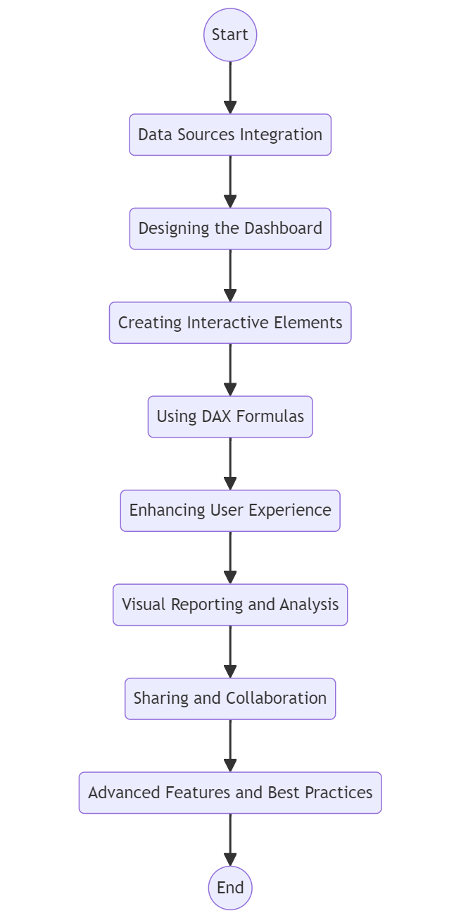
Interactive dashboards are crucial in business intelligence by helping organizations make data-driven decisions. One powerful tool for data visualization is Power BI, a robust business analytics solution by Microsoft.
With Power BI, users can create visually appealing and interactive dashboards that display real-time data in a meaningful way. By utilizing Power BI, businesses gain the ability to import data from various sources, clean and transform it, and present insights through visualizations effortlessly.
This streamlines the decision-making process and enhances productivity by providing a consolidated view of key metrics. Moreover, Power BI’s user-friendly interface and extensive library of visualization options make it an ideal choice for professionals seeking to harness the power of data visualization in their analytics projects.
Power BI is a powerful tool that enables users to create interactive dashboards in business intelligence. Through data visualization, organizations can gain valuable insights into their data to make informed decisions.
Getting started with Power BI begins with downloading and installing Power BI Desktop. Once installed, users can start exploring the interactive features of the tool. The Power BI interface is intuitive and user-friendly, providing users with access to various data visualization tools and data connections.
With Power BI, businesses can turn complex data into visually appealing and easily understandable reports. By mastering Power BI, organizations can transform their raw data into actionable insights, leading to improved decision-making processes and ultimately, greater business success.
Key Components of Power BI Include:
Power BI Desktop: A Windows application used for creating reports.
Power BI Service: An online SaaS (Software as a Service) that enables sharing and collaboration.
Power BI Mobile: Apps available for Android, iOS, and Windows mobile devices.
Power BI Report Server: An on-premises report server where you can publish Power BI reports after creating them in Power BI Desktop.
Benefits of Using Power BI:
Ease of Use: Power BI has an intuitive interface with drag-and-drop functionality, making it accessible to users with various levels of technical expertise.
Integration: It integrates seamlessly with a wide range of data sources, including Excel, SQL Server, Azure, and third-party services like Google Analytics and Salesforce.
Scalability: Power BI is scalable for any size of organization, from small businesses to large enterprises.
Cost-Effectiveness: Power BI offers various pricing plans, including a free version, which makes it an affordable option for businesses of all sizes.
Installing and Setting Up Power BI Desktop
System Requirements:
Before installing Power BI Desktop, ensure that your system meets the following requirements:
Operating System: Windows 7 or later, 64-bit (x64)
Processor: 1 gigahertz (GHz) or faster 64-bit (x64) processor
2. Navigate to the "Products" tab and select "Power BI Desktop."
3. Click the "Download Free" button. This will redirect you to the Microsoft Store.
4. Click "Get" to start the download and installation process.
5. Follow the on-screen instructions to complete the installation.
Setting Up Power BI Desktop:
Launching Power BI Desktop: After installation, launch Power BI Desktop by clicking on its icon.
Signing In: If you have a Power BI account, sign in using your credentials. If not, you can sign up for a free Power BI account.
Initial Configuration: Configure basic settings such as your preferred language and regional settings.
Updates: Ensure that Power BI Desktop is up-to-date by checking for updates regularly. You can do this by going to `File > Options and Settings> Options > Updates`.
Overview of the Power BI Interface
Home Screen:
Ribbon: The ribbon at the top provides quick access to commonly used features and functions, including data import, visualizations, and formatting tools.
Report View: The main area where you create and customize your reports and dashboards.
Data View: This allows you to view and manage the data that you have imported into Power BI.
Model View: Used to create relationships between different tables of data.
Key Interface Elements:
Fields Pane: Located on the right side, this pane lists all the tables and fields available for use in your reports.
Visualizations Pane: Also on the right side, this pane contains various visualization types that you can drag and drop onto the report canvas.
Filters Pane: This allows you to apply filters to your data to refine the insights shown in your visualizations.
Creating a Basic Report:
Importing Data: Click on `Get Data` in the ribbon to import data from various sources such as Excel, SQL Server, or web services.
Creating Visualizations: Select a data field and drag it onto the report canvas. Choose a visualization type from the Visualizations pane.
Formatting: Use the formatting options in the Visualizations pane to customize the appearance of your charts and graphs.
Saving: Save your report by clicking on `File > Save As` and choosing a location on your computer.
By following these steps and familiarizing yourself with the Power BI interface, you'll be well-equipped to start creating powerful and interactive dashboards that can provide valuable insights for your business.
When working with Power BI, one of the first steps is connecting to different data sources. By seamlessly integrating various sources like Excel spreadsheets, databases, web services, and more, you can bring all your data under one roof for comprehensive analysis.
Power BI also provides immense flexibility when it comes to importing data. Whether you import data from local files or cloud-based sources, the process is simplified, giving you more time to analyze and act on the insights generated.
Start Creating Interactive Dashboards with Our Power BI
Another critical aspect of data handling is the transformation and cleaning process, which can be efficiently achieved through Power Query. This powerful tool allows for restructuring, text extraction, data consolidation, and many other operations to ensure your data is in the best shape for analysis.
By combining the capabilities of Power BI with these aspects of data integration, users can harness the full potential of their raw data for informed decision-making and forecasting.
Power BI supports a wide range of data sources, allowing you to import data from various platforms and services. These sources include files, databases, online services, and direct connections to live data.
Types of Data Sources:
Files: Excel, CSV, XML, JSON, PDF, etc.
Databases: SQL Server, MySQL, Oracle, PostgreSQL, etc.
Online Services: SharePoint, OneDrive, Google Analytics, Salesforce, Dynamics 365, etc.
Other Sources: Web, OData feeds, Azure services, and more.
Steps to Connect to Data Sources:
Open Power BI Desktop: Launch the application.
Get Data: Click on the `Get Data` button in the Home tab.
Select Data Source: Choose the type of data source you want to connect to from the list.
Provide Connection Details: Enter necessary details such as file path, server name, database name, or API credentials.
Authenticate: Depending on the data source, you may need to provide authentication credentials.
Load Data: Once connected, preview the data and click on `Load` to import it into Power BI.
Importing Data into Power BI
Data Import Process:
Data Selection: After connecting to a data source, a navigator window will appear, showing the available tables or data structures.
Preview Data: Preview the data to ensure it’s the correct dataset.
Load or Edit: You can either directly load the data into Power BI or click on `Transform Data` to make adjustments using Power Query.
Direct Query vs. Import Mode:
Import Mode: Data is imported into Power BI, allowing for faster performance and the ability to work offline.
Direct Query: Queries are sent directly to the data source in real-time, ensuring you always work with the most current data. This mode may have performance considerations depending on the data source and query complexity.
Data Transformation and Cleaning Using Power Query
Introduction to Power Query:
Power Query is a data connection technology that enables you to discover, connect, combine, and refine data across a wide variety of sources. It’s integrated into Power BI Desktop, allowing for powerful data transformation capabilities.
Steps for Data Transformation:
Open Power Query Editor: Click on `Transform Data` in the Home tab to launch the Power Query Editor.
Navigating the Power Query Editor:
Query Pane: Lists all the queries in the current workbook.
Data Preview: This shows a preview of the data for the selected query.
Applied Steps: Displays the steps applied to the data, such as import, transform, and load actions.
Common Data Transformation Tasks:
Renaming Columns: Double-click on a column header to rename it.
Changing Data Types: Click on the data type icon in the column header to change the data type (e.g., text, number, date).
Removing Columns: Right-click on a column header and select `Remove`.
Filtering Rows: Use the filter icon in the column header to filter data based on specific criteria.
Replacing Values: Right-click on a column and select `Replace Values` to substitute specific values.
Splitting Columns: Right-click on a column and select `Split Column` to divide it based on delimiters or the number of characters.
Advanced Data Transformation:
Merging Queries: Combine two or more queries into a single query by merging them based on a common column.
Appending Queries: Stack data from multiple queries into a single query by appending them.
Pivoting and Unpivoting Columns: Transform columns into rows (unpivot) or rows into columns (pivot) to reshape data.
Grouping Data: Aggregate data by grouping rows based on one or more columns.
Saving and Applying Changes:
Once you have completed your data transformations:
1. Click on `Close & Apply` in the Power Query Editor.
2. The transformed data will be loaded into Power BI, ready for use in your reports and dashboards.
By connecting to various data sources, importing data, and utilizing Power Query for data transformation and cleaning, you can ensure that your Power BI dashboards are built on accurate, clean, and relevant data. This sets a solid foundation for effective data analysis and visualization.
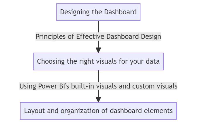
When designing a dashboard, it is crucial to keep in mind the principles of effective dashboard design. This includes choosing the right visuals for your data, whether it be bar charts, line graphs, or heat maps.
Power BI offers a variety of built-in visuals and custom visuals to help you perfectly represent your data. Moreover, the layout and organization of dashboard elements play a significant role in user understanding and interaction.
By following these guidelines and utilizing the tools available, you can create an informative and visually appealing dashboard.
Keep It Simple: Avoid clutter and focus on key metrics. Too much information can overwhelm users.
Use Clear Labels: Ensure all visual elements are clearly labeled with understandable titles and descriptions.
Consistent Formatting: Maintain consistent formatting for colors, fonts, and sizes to enhance readability.
Purpose and Audience:
Define Objectives: Understand the primary purpose of the dashboard and what insights you want to convey.
Know Your Audience: Tailor the dashboard to meet the needs and technical expertise of the intended audience.
Actionable Insights:
Highlight Key Metrics: Focus on metrics that drive decision-making and actionable insights.
Use Visual Cues: Use colors, icons, and other visual cues to draw attention to important data points.
Data Accuracy and Integrity:
Ensure Accuracy: Verify data accuracy to maintain trust and reliability.
Update Regularly: Keep the dashboard updated with the latest data to ensure relevance.
Choosing the Right Visuals for Your Data
Types of Visualizations:
Bar Charts: Best for comparing different categories.
Line Charts: Ideal for showing trends over time.
Pie and Donut Charts: Useful for showing proportions and parts of a whole.
Tables and Matrix: Good for displaying detailed data with precise values.
Maps: Effective for geographical data representation.
Cards and KPIs: Highlight key metrics and performance indicators.
Choosing Based on Data and Goals:
Comparative Analysis: Use bar charts and column charts for side-by-side comparisons.
Trend Analysis: Line charts and area charts are best for identifying trends over time.
Distribution: Histograms and scatter plots help in understanding data distribution.
Part-to-Whole Relationships: Pie charts and stacked bar charts show how parts contribute to a whole.
Geographical Data: Maps provide a visual representation of data across different regions.
Using Power BI's Built-In Visuals and Custom Visuals
Built-In Visuals:
Power BI offers a wide range of built-in visuals that cover most standard visualization needs. These include bar charts, line charts, pie charts, maps, tables, and more. They are easily accessible from the Visualizations pane in Power BI Desktop.
Custom Visuals:
For more specialized or unique visualization needs, Power BI supports custom visuals:
Power BI Visuals Marketplace: Access the marketplace directly from Power BI Desktop to browse and download custom visuals.
Importing Custom Visuals:
Click on the ellipsis (...) in the Visualizations pane.
Select `Import from marketplace` or `Import from file`.
Browse and add the custom visual to your report.
Creating Custom Visuals: For advanced users, Power BI allows the creation of custom visuals using the Power BI Developer Tools and custom visual SDK.
Layout and Organization of Dashboard Elements
Grid Layout:
Use a Grid: Align elements using a grid layout to ensure a clean and organized look.
Spacing and Padding: Maintain consistent spacing and padding between elements to avoid clutter.
Hierarchy and Flow:
Visual Hierarchy: Arrange elements to guide the user’s eye through the dashboard logically, placing the most important information at the top or in a prominent position.
Logical Grouping: Group related visuals together to tell a coherent story.
Interactivity and Navigation:
Interactive Elements: Use filters, slicers, and drill-through options to enable users to interact with the data.
Navigation Buttons: Include buttons and bookmarks to facilitate easy navigation between different sections or views of the dashboard.
Responsiveness and Adaptability:
Responsive Design: Design dashboards that adapt well to different screen sizes, ensuring usability on both desktop and mobile devices.
Mobile View: Utilize Power BI’s mobile layout view to customize how the dashboard will appear on mobile devices.
Consistent Design Elements:
Color Scheme: Use a consistent color scheme aligned with your organization’s branding or to highlight specific data points.
Fonts and Typography: Choose readable fonts and maintain consistent font sizes across the dashboard.
Icons and Imagery: Use icons and images sparingly and ensure they add value to the data representation.
By adhering to these principles and best practices, you can design effective, user-friendly dashboards in Power BI that deliver clear, actionable insights and enhance decision-making processes.
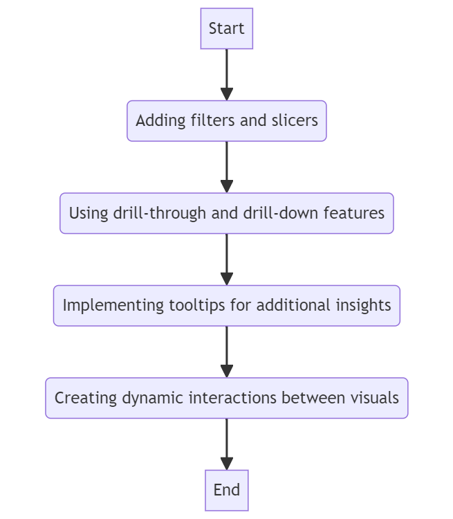
Creating interactive elements in your visualizations can greatly enhance user engagement and understanding. By incorporating filters and slicers, users can tailor their viewing experience to focus on specific data points.
Utilizing drill-through and drill-down features allows for deeper exploration of information, providing a more comprehensive analysis. Implementing tooltips for additional insights offers users a quick peek into details that may not be immediately obvious.
Creating dynamic interactions between visuals ensures a seamless flow of information, guiding users through a more interactive and engaging data visualization experience.
Adding Filters and Slicers
Filters:
Filters in Power BI are used to refine data and focus on specific subsets. There are several types of filters:
Report-Level Filters: Apply to the entire report, filtering all pages.
Page-Level Filters: Apply to a specific page within a report.
Visual-Level Filters: Apply to a single visual within a page.
How to Add Filters:
Select the visual or report area you want to filter.
Drag the desired field to the Filters pane on the right.
Choose the filter type (basic, advanced, top N) and configure filter conditions.
Slicers:
Slicers are visual tools that provide a user-friendly way to filter data on reports.
Adding a Slicer:
Click on the `Slicer` icon in the Visualizations pane.
Drag a field into the `Field` well to create the slicer.
Configuring Slicers:
You can format slicers to allow single or multiple selections.
Customize the slicer appearance through the Format pane.
Types of Slicers:
Text slicers for categorical data.
Date slicers for time-based data.
Hierarchical slicers for data with multiple levels.
Using Drill-Through and Drill-Down Features
Drill-Through:
Drill-through allows users to navigate from a summary report to a detailed report.
Setting Up Drill-Through:
Create a detailed page with the relevant fields.
In the Fields pane, drag the desired field to the `Drill-through` filters section.
Add a back button to navigate back to the main report (use `Insert > Buttons > Back`).
Using Drill-Through:
Right-click on a data point in the summary report and select the drill-through option to view detailed data.
Drill-Down:
Drill-down enables users to explore data hierarchically within the same visual.
Creating Hierarchies:
In the Fields pane, right-click on a field and select `New Hierarchy`.
Drag additional fields into the hierarchy.
Enabling Drill-Down:
Select a visual that supports hierarchies (e.g., bar chart, line chart).
Click on the `Drill Down` button in the top-right corner of the visual.
Interact with the visual by clicking on data points to drill down into more detailed levels.
Implementing Tooltips for Additional Insights
Tooltips:
Tooltips provide additional context and information when users hover over data points in a visual.
Default Tooltips:
By default, Power BI shows basic information like values and categories in tooltips.
Custom Tooltips:
Create a new report page to serve as a tooltip page.
Design the tooltip with relevant visuals and information.
Configure the page size to `Tooltip` size under `Page Settings`.
Assigning Tooltips:
Select a visual and go to the Format pane.
Expand the `Tooltip` section and set the `Page` option to your custom tooltip page.
Creating Dynamic Interactions Between Visuals
Dynamic Interactions:
Power BI allows interactions between visuals to provide a more interactive experience.
Cross-Filtering and Cross-Highlighting:
When a user selects a data point in one visual, other visuals on the page update to reflect the selection.
Configure interactions by selecting a visual and clicking on the `Format` tab, then choose `Edit Interactions`.
Syncing Slicers:
Use the `Sync Slicers` feature to apply the same slicer selections across multiple pages.
Select a slicer, go to the `View` tab, and click on `Sync Slicers`.
Configure which pages the slicer should sync with.
Bookmarks:
Create bookmarks to capture the current state of a report, including filter selections, drill positions, and visibility of visuals.
Use bookmarks to create custom navigation, storytelling, or toggle between different views.
Access bookmarks via `View > Bookmarks Pane`, then `Add` bookmarks and manage their properties.
Implementing Dynamic Interactions:
Selection Pane: Manage the visibility of visuals and shapes on a page.
Buttons and Actions: Use buttons to trigger actions like navigating to a bookmark, page, or URL.
Add buttons from the `Insert` tab.
Configure button actions in the Format pane under the `Action` section.
By leveraging these interactive elements, you can create highly engaging and user-friendly dashboards in Power BI that allow users to explore data deeply and gain valuable insights.
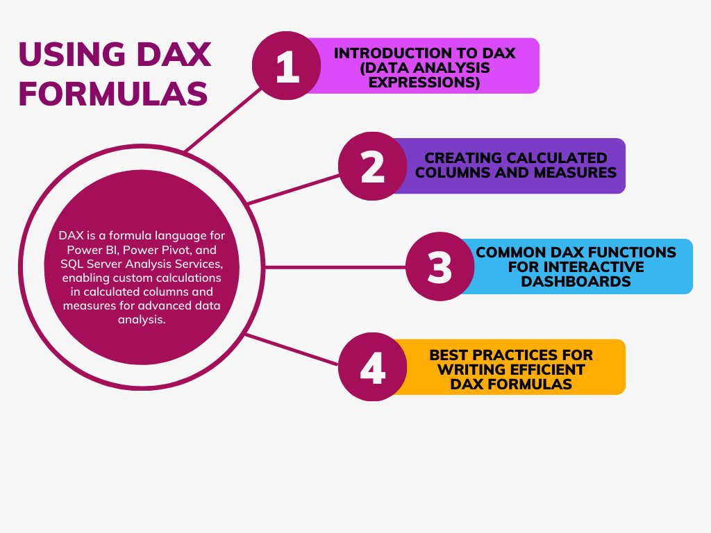
6. Using DAX Formulas
DAX Formulas are the backbone of Microsoft Power BI and are used to create calculated columns and measures to perform complex calculations. By understanding the basics of DAX, users can create interactive dashboards with ease.
Common DAX functions such as SUM, AVERAGE, and CALCULATE are essential for data manipulation. To write efficient DAX formulas, it’s crucial to optimize calculation performance by using FILTER and ALL functions sparingly.
Additionally, staying organized by creating separate measures for different calculations and using comments to explain the logic will enhance the readability and maintenance of DAX formulas.
Introduction to DAX (Data Analysis Expressions)
What is DAX?
DAX (Data Analysis Expressions) is a formula language used in Power BI, Power Pivot, and SQL Server Analysis Services. It allows you to create custom calculations in calculated columns and measures to analyze data in more sophisticated ways.
Key Features of DAX:
Flexible Calculations: Perform a wide range of calculations from simple arithmetic to complex statistical analysis.
Time Intelligence: Built-in functions to work with dates and times for cumulative totals, year-to-date calculations, etc.
Data Manipulation: Functions to filter, group, and aggregate data dynamically.
Creating Calculated Columns and Measures
Calculated Columns:
Calculated columns add new data to your table. They are calculated row by row.
How to Create:
Go to the Data view in Power BI Desktop.
Select the table where you want to add the calculated column.
Example: `Full Name = CONCATENATE('Customer'[First Name], 'Customer'[Last Name])`
`LEFT()`, `RIGHT()`: Extracts a specified number of characters from the left or right side of a text string.
Best Practices for Writing Efficient DAX Formulas
Optimize Performance:
Avoid Nested Calculations: Minimize the use of complex, nested calculations as they can slow down performance.
Use Variables: Use variables (`VAR`) to store intermediate calculations and reuse them.
Example:
```DAX
VAR TotalCost = SUM('Sales'[Cost])
RETURN TotalCost * 1.2
```
Filter Context Awareness: Be aware of filter context and how it affects your measures. Use `CALCULATE()` to modify filter context when necessary.
Maintain Readability:
Descriptive Names: Use descriptive names for measures and columns to make your DAX formulas easier to understand.
Comments: Add comments in your DAX code to explain complex logic.
Example:
```DAX
-- Calculate year-to-date sales
YTD Sales = TOTALYTD([Total Sales], 'Date'[Date])
```
Debugging and Testing:
Step-by-Step Calculation: Break down complex formulas into smaller parts and test each part individually.
Use DAX Studio: Utilize tools like DAX Studio for performance analysis and debugging.
Consistent Formatting:
Indentation: Use consistent indentation and formatting to improve readability.
Logical Grouping: Group related calculations together to enhance structure.
By mastering DAX formulas, you can create powerful and dynamic calculations that enhance the interactivity and analytical capabilities of your Power BI dashboards.
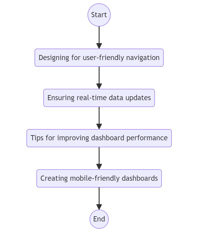
Enhancing user experience is essential for any successful application or website. When designing, prioritizing user-friendly navigation helps users find what they need quickly and easily. Ensuring real-time data updates keeps information current and relevant. To improve dashboard performance, consider minimizing complex graphics that may slow loading times.
Additionally, focus on creating mobile-friendly dashboards to cater to users accessing the platform on various devices. By prioritizing these factors, you can significantly enhance the user experience and increase overall satisfaction.
Designing for User-Friendly Navigation
Intuitive Layout:
Logical Flow: Arrange visuals in a logical flow that guides users through the data story. Key metrics should be prominently placed at the top or center.
Consistent Design: Maintain a consistent design language throughout the dashboard, including color schemes, fonts, and visual styles.
Interactive Elements:
Buttons and Bookmarks: Use buttons and bookmarks to create a seamless navigation experience. For example, buttons can link to different report pages or trigger specific bookmarks.
Creating Buttons: Insert > Buttons, then configure actions in the Format pane.
Using Bookmarks: View > Bookmarks Pane, then add bookmarks and link them to buttons.
Drill-Through: Implement drill-through functionality to allow users to navigate from summary views to detailed views.
Tooltips: Use custom tooltips to provide additional context and information without cluttering the dashboard.
Navigation Pane:
Using a Navigation Pane: Create a navigation pane with buttons for easy access to different report sections or pages.
Tabs and Sections: Use tabs or sections to organize content logically, making it easier for users to find the information they need.
Ensuring Real-Time Data Updates
Direct Query:
Live Data: Use Direct Query mode to connect directly to data sources, ensuring that the data displayed in the dashboard is always up-to-date.
Performance Considerations: Be mindful of potential performance issues with Direct Query, especially with complex queries or large datasets.
Scheduled Refresh:
Automatic Refresh: Configure scheduled refreshes for imported data to ensure the dashboard is updated at regular intervals.
Setting Up Scheduled Refresh: In the Power BI service, go to Settings > Datasets > Scheduled Refresh, and configure the refresh schedule.
Incremental Refresh: Use incremental refresh to update only new or changed data, improving efficiency and reducing load times.
Streaming Data:
Real-Time Dashboards: Use Power BI's streaming dataset capabilities to create dashboards that update in real-time with streaming data.
Creating a Streaming Dataset: In the Power BI service, go to My Workspace > Datasets > Create > Streaming Dataset, then configure your data source.
Tips for Improving Dashboard Performance
Optimize Data Models:
Remove Unnecessary Columns and Tables: Only include columns and tables that are necessary for your analysis.
Reduce Cardinality: Minimize the number of unique values in your columns to improve performance.
Use Appropriate Data Types: Ensure that data types are correctly set to optimize storage and query performance.
Efficient DAX Formulas:
Use Variables: Store intermediate results in variables to avoid repeated calculations.
Avoid Nested Calculations: Simplify DAX formulas by breaking them into smaller, reusable components.
Use SUMMARIZE and ADDCOLUMNS Sparingly: These functions can be resource-intensive and should be used cautiously.
Optimize Visuals:
Limit Number of Visuals: Reduce the number of visuals on a single page to improve rendering performance.
Simplify Charts: Avoid overly complex visuals that require extensive calculations.
Paginated Reports: Use paginated reports for detailed, tabular data that can be exported or printed.
Data Reduction Techniques:
Aggregations: Use aggregations to reduce the amount of data that needs to be processed.
Pre-Aggregated Data: Pre-aggregate data at the source if possible.
Filters and Slicers: Apply filters and slicers to limit the data displayed in visuals.
Creating Mobile-Friendly Dashboards
Responsive Design:
Mobile Layout View: Use the mobile layout view in Power BI Desktop to design dashboards specifically for mobile devices.
Switch to Mobile Layout: View > Mobile Layout, then arrange visuals for optimal viewing on smaller screens.
Simplify Content: Focus on the most important metrics and visuals, removing any non-essential elements for mobile users.
Optimize for Touch:
Larger Buttons and Slicers: Use larger buttons and slicers to ensure they are easy to interact with on touchscreens.
Spacing and Padding: Increase spacing and padding between elements to prevent accidental touches and improve usability.
Performance Considerations:
Lightweight Visuals: Use lightweight visuals that render quickly on mobile devices.
Efficient Queries: Ensure that the queries driving mobile dashboards are efficient to reduce load times.
Testing and Feedback:
Test on Multiple Devices: Test the mobile version of the dashboard on different devices and screen sizes to ensure compatibility and usability.
Gather User Feedback: Collect feedback from mobile users to identify areas for improvement and ensure the dashboard meets their needs.
By focusing on user-friendly navigation, ensuring real-time data updates, optimizing performance, and designing for mobile devices, you can enhance the overall user experience of your Power BI dashboards, making them more effective and engaging for users.
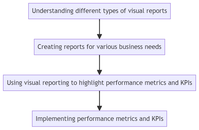
8. Visual Reporting and Analysis
Visual reporting and analysis play a crucial role in conveying complex information in a simple and digestible manner. The key to effective visual reporting lies in understanding the different types of visual reports and selecting the most appropriate ones for your business needs.
Whether it’s tracking sales performance, analyzing financial data, or evaluating operational efficiencies, visual reports can help highlight key performance metrics and Key Performance Indicators (KPIs). By implementing these metrics effectively, businesses can gain valuable insights and make informed decisions to drive success.
Understanding Different Types of Visual Reports
Types of Visual Reports:
Descriptive Reports:
Purpose: Provide a snapshot of current and historical data to understand what has happened.
Detailed Analysis: Use tables and matrixes for in-depth analysis of detailed data.
Example: Financial statements, sales by product.
Implementing Performance Metrics and KPIs
Identifying Relevant Metrics:
Align with Objectives: Choose metrics that align with your business goals and strategic objectives.
Actionable Insights: Select metrics that provide actionable insights and drive decision-making.
Calculating KPIs:
Using DAX: Create measures in Power BI to calculate KPIs using DAX formulas.
Example: `Sales Growth = (SUM('Sales'[Current Year Sales]) - SUM('Sales'[Previous Year Sales])) / SUM('Sales'[Previous Year Sales])`
Data Aggregation: Aggregate data appropriately to ensure accurate KPI calculations.
Visualizing KPIs:
Consistent Format: Use a consistent format and design for KPI visuals to enhance readability and interpretation.
Contextual Information: Provide contextual information such as targets, benchmarks, and historical comparisons.
Dynamic Interactions: Enable dynamic interactions like drill-downs and filters to allow users to explore KPI details.
Monitoring and Updating:
Regular Updates: Ensure KPIs are updated regularly to reflect current data.
Real-Time Data: Implement real-time data updates for critical KPIs that require immediate attention.
Feedback Loop: Gather user feedback to refine and improve KPI tracking and visualization.
By understanding different types of visual reports, creating tailored reports for various business needs, effectively highlighting performance metrics and KPIs, and implementing best practices for performance metrics, you can leverage visual reporting and analysis in Power BI to drive better business decisions and improve overall performance.
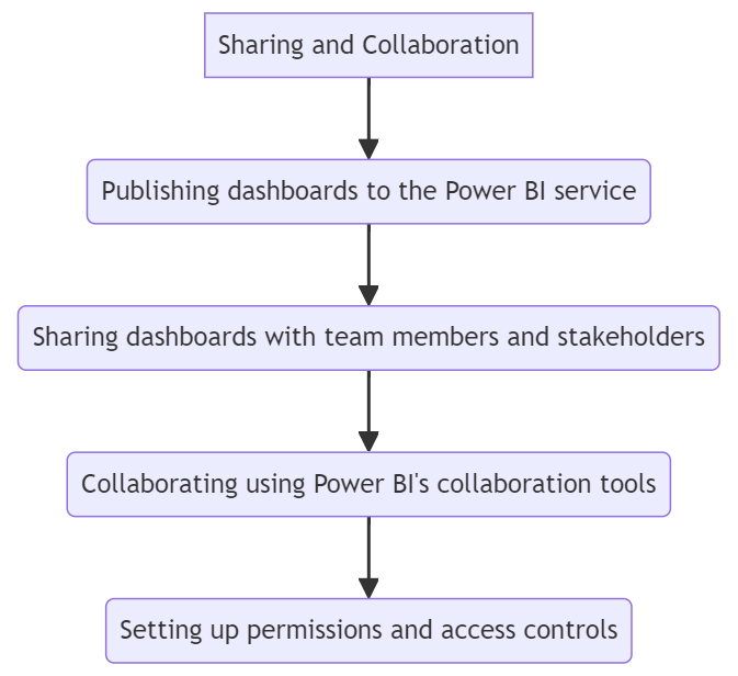
9. Sharing and Collaboration
Sharing and collaboration are essential components when it comes to analyzing and interpreting data in Power BI. By publishing dashboards to the Power BI service, users can easily share their insights with team members and stakeholders. This promotes a collaborative environment by allowing for the sharing of information and ideas effortlessly.
Additionally, Power BI’s collaboration tools facilitate seamless teamwork by enabling users to work together on datasets, reports, and dashboards. Setting up permissions and access controls ensures that sensitive information is protected and only accessible to authorized individuals.
Publishing Dashboards to the Power BI Service
Steps to Publish:
Prepare Your Dashboard:
Ensure your dashboard is complete and all visuals are functioning as intended.
Test your dashboard for performance and accuracy.
Sign In to Power BI:
Open Power BI Desktop and sign in to your Power BI account.
Publish the Dashboard:
Click on the `Publish` button in the Power BI Desktop toolbar.
Select the workspace where you want to publish the dashboard.
Wait for the publishing process to complete, and a confirmation message will appear.
Add users and assign them the appropriate roles based on their responsibilities.
Row-Level Security (RLS):
Define Security Roles:
Create security roles in Power BI Desktop to restrict data access at the row level.
Go to `Modeling > Manage Roles` and define roles with DAX expressions to filter data.
Assign Users to Roles:
Publish the report to the Power BI service.
In the dataset settings, go to `Security` and assign users to the defined roles.
Managing Dataset Permissions:
Dataset Access:
Manage who can access, share, and build on your datasets in the Power BI service.
Go to the dataset settings and configure permissions for different users or groups.
Best Practices for Permissions and Access Controls:
Principle of Least Privilege: Assign the minimum necessary permissions to users to reduce security risks.
Regular Audits: Periodically review permissions and access controls to ensure they align with current needs and policies.
Documentation: Document access controls and permission settings for transparency and future reference.
By effectively publishing, sharing, and collaborating on Power BI dashboards, and setting up robust permissions and access controls, you can enhance the accessibility, security, and collaborative potential of your data insights.
10. Advanced Features and Best Practices
Leveraging advanced features in Power BI can take your dashboards to the next level. Users can create stunning and dynamic charts, graphs, and reports by customizing visuals with Power BI Visualizations. Utilizing bookmarks and storytelling features helps in creating engaging and interactive narratives within your dashboards.
Followed by Best practices for dashboard performance optimization and incorporating these techniques can make a significant difference in the overall user experience. Case studies featuring effective interactive dashboards provide valuable insights on how to bring data to life in a compelling and meaningful way.
Customizing Visuals Using Power BI Visualizations
Built-In Visuals:
Custom Formatting:
Customize the appearance of built-in visuals by modifying colors, labels, and titles.
Use the Format pane to adjust settings like data labels, legend positions, axis titles, and font sizes.
Conditional Formatting:
Apply conditional formatting to highlight important data points.
Example: Use color scales to represent different ranges of values in tables or matrix visuals.
Set up rules in the Format pane under Data Colors or Values.
Hierarchical Axis:
Use hierarchical axes to display multi-level categorical data in a single visual.
Example: Show sales by region and within each region, by state.
Custom Visuals:
Using Custom Visuals from AppSource:
Import custom visuals from Microsoft AppSource to enhance your reports.
Go to Visualizations pane > Import a visual > From AppSource, then search and add the desired visual.
Developing Custom Visuals:
For more advanced needs, create custom visuals using Power BI’s Developer tools.
Example: Use D3.js or other libraries to create bespoke visualizations.
Interactive Features:
Cross-Filtering and Cross-Highlighting:
Enable cross-filtering and cross-highlighting to create interactive reports where selecting a data point in one visual filters or highlights data in others.
Set interactions in the Format pane under Edit interactions.
Tooltips:
Add custom tooltips to provide additional context for data points.
Use the Report page tooltips feature to design detailed tooltips as separate report pages.
Using Bookmarks and Storytelling Features
Bookmarks:
Creating Bookmarks:
Use bookmarks to capture the current state of a report page, including filters, slicers, and visual selections.
Go to View > Bookmarks Pane, then add a new bookmark.
Using Bookmarks for Navigation:
Create navigation buttons to switch between bookmarks.
Example: Design a button to reset filters or navigate to a detailed view.
Storytelling:
Using the Play Axis:
Create time-based animations using the Play Axis custom visual.
Example: Show how data evolves with animated line charts or scatter plots.
Drill-Through and Drill-Down:
Use drill-through pages to provide detailed insights from summary data.
Example: Right-click on a data point and choose Drill through to navigate to a detailed page.
Narratives:
Add narrative text boxes to provide explanations and context for data stories.
Example: Use text boxes to describe trends, anomalies, or insights derived from the data.
Best Practices for Dashboard Performance Optimization
Data Model Optimization:
Remove Unnecessary Data:
Eliminate unused columns and tables to streamline the data model.
Use Power Query to filter out unneeded rows and columns before loading data into Power BI.
Optimizing Relationships:
Use a star schema design to optimize relationships between tables.
Avoid using complex many-to-many relationships and reduce bidirectional relationships.
DAX Optimization:
Efficient DAX Queries:
Write efficient DAX formulas to minimize calculation time.
Example: Use variables to store intermediate results and avoid repeated calculations.
Reduce Complex Calculations:
Break down complex calculations into simpler, reusable components.
Example: Create separate measures for intermediate steps.
Visual and Report Optimization:
Limit Visuals on a Page:
Reduce the number of visuals on a single report page to improve rendering times.
Example: Use slicers to filter data rather than displaying all data at once.
Optimizing Visuals:
Use less resource-intensive visuals, like basic charts and tables, where possible.
Example: Replace complex custom visuals with built-in visuals when performance is an issue.
Pagination:
Split large reports into multiple pages to distribute the data load.
Example: Create a summary page with links to detailed pages for in-depth analysis.
Case Studies of Effective Interactive Dashboards
Case Study 1: Sales Performance Dashboard
Context: A retail company needed a dashboard to track sales performance across regions and product lines.
Key Features:
Visuals Used: Line charts for sales trends, bar charts for sales by region, and pie charts for product category distribution.
Interactivity: Slicers for filtering by date, region, and product category; drill-through to detailed sales reports.
Performance Metrics: KPIs for total sales, sales growth percentage, and average order value.
Case Study 2: Financial Dashboard
Context: A financial services firm requires a dashboard to monitor key financial metrics and performance indicators.
Key Features:
Visuals Used: Waterfall charts for profit and loss analysis, gauges for KPI tracking, and tables for financial statements.
Interactivity: Bookmarks for scenario analysis, tooltips for additional financial context, drill-down for detailed views.
Performance Metrics: KPIs for revenue, expenses, net profit margin, and budget vs. actuals.
Case Study 3: Operational Efficiency Dashboard
Context: A manufacturing company needed a dashboard to track operational efficiency and production metrics.
Key Features:
Visuals Used: Line charts for production volume trends, bar charts for downtime analysis, and gauges for efficiency metrics.
Interactivity: Play axis for time-based animations, slicers for filtering by production line, drill-through to detailed operations reports.
Performance Metrics: KPIs for production volume, operational efficiency, downtime percentage, and inventory levels.
By leveraging advanced features like custom visuals, bookmarks, and storytelling tools, and adhering to best practices for performance optimization, you can create highly effective and interactive Power BI dashboards that provide deep insights and drive better decision-making. The case studies demonstrate how these principles can be applied in real-world scenarios to meet diverse business needs.
11. Conclusion
This article outlines steps for creating interactive dashboards with Power BI. Key points include the significance of interactive dashboards for visualization and decision-making, installation and setup of Power BI Desktop, and data source integration using Power Query.
Effective dashboard design principles are emphasized, alongside adding interactive elements like filters and tooltips. It introduces DAX for calculated columns and measures and highlights enhancing user experience through navigation and real-time updates.
Visual reporting, sharing dashboards, and advanced features like customization and performance optimization are also discussed. Lastly, users are encouraged to explore and innovate with Power BI to maximize insights and data value.
Resources for Further Learning and Community Support
To further enhance your Power BI skills and stay updated with the latest developments, make use of the following resources:
12. Additional Resources
Power BI Community Forums and Blogs
Community Forums:
Power BI Community: Engage with the Power BI community to ask questions, share knowledge, and learn from others. (Power BI Community)
Blogs:
Microsoft Power BI Blog: Stay updated with the latest news, updates, and tips from the official Power BI blog. (Power BI Blog)
Enterprise DNA Blog: Find articles, tutorials, and tips on advanced Power BI techniques. (Enterprise DNA Blog)
Recommended Books and Courses on Power BI
Books:
"Mastering Power BI" by Brett Powell: A comprehensive guide to mastering Power BI, including advanced techniques and best practices.
"The Definitive Guide to DAX" by Marco Russo and Alberto Ferrari: An in-depth exploration of DAX for Power BI, focusing on practical examples and advanced concepts.
Courses:
Microsoft Power BI Guided Learning: Free, self-paced online courses offered by Microsoft to learn Power BI from basics to advanced levels. (Power BI Guided Learning)
Official Microsoft Documentation and Tutorials
Microsoft Documentation:
Power BI Documentation: Official documentation from Microsoft covering all aspects of Power BI, including setup, features, and troubleshooting. (Power BI Documentation)
Tutorials:
Microsoft Learn: Offers interactive tutorials and learning paths for Power BI. (Microsoft Learn Power BI)
Get a Free Consultation from Infiniticube
Are you looking to enhance your data storytelling capabilities with Power BI?
Our team of experienced professionals will guide you through the best practices in data visualization, dashboard design, and insightful reporting to ensure your business intelligence tools drive data-driven decision-making.
Why Choose Infiniticube?
Expert Guidance
Customized Solutions
Best Practices
Interactive Dashboards
Take the first step towards transforming your data into powerful stories that drive results. Contact us today for a free consultation and see how Infiniticube can help you achieve your data visualization goals.
He is working with infiniticube as a Digital Marketing Specialist. He has over 3 years of experience in Digital Marketing. He worked on multiple challenging assignments.
Our newsletter is finely tuned to your interests, offering insights into AI-powered solutions, blockchain advancements, and more. Subscribe now to stay informed and at the forefront of industry developments.


 June 27, 2025
 Balbir Kumar Singh
 0
0


Leave a Reply