Landing pages motivate users to fulfill the purpose of "landing" there. These objectives change with the industry. For the eCommerce landing page, it could be add to cart or buy now. Similarly, for digital marketing agencies and SaaS companies, the free trial/demo version.
A landing page’s general intention is to produce potential leads using the marketing funnel. It is true that potential leads have a higher degree of scope to convert thoroughly into sales if trained properly during the sales funnel period.
Let’s Understand Landing Pages
Most marketers spend a good deal of time generating traffic to their website creation and blog pages, hoping that the targeted audience will fill out the opt-in form.
But if your opt-in form doesn’t attract prospective clients into your sales funnel — can’t aware of your services and convert them into clients, you are wasting time.
Landing page designs are such a big deal and creating a high-quality landing page demands more than throwing meaningless graphics, unnecessary writing, and a confusing call-to-action (CTA) button.
First, let’s see what exactly is landing page optimization and what landing page companies do.
What Is Landing Page Optimization?
Landing page optimization speaks about the manner of improving each detail on your simple landing page design to boost conversions. As opposed to recreating the whole page predicated on your gut feeling, you research stats and anecdotal evidence.
This way, you can gather data and get some knowledge before you even create your own website and landing page and make it live. Examining your readers would be beneficial as it assists you in understanding what your audience requires and desires.
Having said that, you won’t able to design an ideal and simple landing page design right away. Alternatively, you make the page go live — next, observe the performance, then make some changes if you see any negative results. Just keep on analyzing and observing the data for betterment, and your conversion rate will keep on moving higher and higher.
What Is a Landing Page Conversion Rate?
Landing page conversion rates are a basic metric to explain how your business is operating. It is very much possible to determine the conversion rate considering you have two metrics:
Number of people who hit your website
Number of individuals converted (took the required action)
All you need is simple math to recognize your high-converting landing pages from the flops. Many platforms are available to show the reports, such as Google Analytics, which can show the metrics and performance of your landing pages.
Once you are done with it, you can start optimizing the landing pages and as a result, you will see an increase in your conversion rate.
What Is Considered Being a Good Landing Page Conversion Rate?
It is very hard to answer. It's not a one-size-fits-all solution.
The truth is… it depends.
It differs from business to business, the goals of businesses are not the same, the products of all businesses are not the same. Accordingly, the call to action button is also not going to be the same for every business.
Nevertheless, if you want to know the general approximation, then 2–5% is a typical range. According to WordStream, a 2.35% is the average across industries in a detailed article about this particular subject.
Landing page conversion rates, in excess of 10% are not unheard of. Now you might be asking yourself — how do you get there? What do you have to do to get those high-converting pages?
Well, that is exactly what I am going to explain in this article, so read on carefully from here on.
How Can I Improve My Landing Page Conversion Rate?
Optimizing conversions can seem like a daunting task. No doubt it is, but if you follow the next 13 steps, then it is a doable task. You see, optimizing a simple landing page design is both an art and a science.
You might think that you need a Ph.D. to understand it. Truth be told, you just need a checklist. If you want to see all of them at once, then you can directly jump into the conclusion section, where I listed all the ingredients you need to create an ideal and simple landing page design along with some other notable mentions.
Know Your Campaign Goals
Landing pages lack focus on one particular goal or CTA
Do not provide multiple offers that mislead your customers
Do not make users lose sight of the conversion element of the landing page
The key is to design landing pages that concentrate on only one offer that won’t baffle the users
2. Know Who You Are Talking To (Target Audience)
Give yourself some time to figure out who lands on your page.
What you want them to read, see, and how you want them to go through your page. It is important to get them to convert.
Your targeted consumers need special treatment when you move them on a journey with strategic targeting and re-targeting.
Start developing traffic systems with specific strategies.
Speak about their needs and preferences and resonate with their pain points.
Maintain a designated landing page design for each campaign, buyer persona, or channel, and ensure you alter the content, respectively.
Address the different pain points, details, and advantages that impact that user.
3. Write Simple Headlines
Readers will not read every word on the page, but they will absolutely read the headlines, so ensure the title is eye-catching, straightforward, short, and summarizes your unique selling points (USPs).
Alter the title now and then to test your copy of the headline to get an eye-catching headline that draws eyeballs from people.
Experiment with your landing page headlines by performing some headline alterations that trigger emotions.
These emotions involve feeling engaging, positive, self-identification, exclusive rights, sense of safety, etc.
Use some tools to check the emotional score of your headlines.
It is a must —keeping your headlines bold and straightforward to get your user’s awareness immediately.
Though it is not important, the following survey makes a lot of sense. On average, 8 out of 10 people will read your headline copy, but only 2 out of 10 will read the remaining text. It should be as brief as possible.
Work on a subheading that delivers the headline’s promise. Always remember people just scan and skim. You assure them they will get the essence of your article and what they get within a matter of seconds.
The landing page heading has a major effect on bounce rates above all other on-page elements.
The header should ensure that the user has made the right choice to hit your website.
Your main page theme should showcase your key selling points and brand value propositions.
Tests and refinements of your headlines can make a world of difference to your conversion volumes.
Use a Copy that Demonstrates You Know Your Customers Challenges
Make sure you understand what your customers want and what they’re looking for.
Connect with your customers at a personal level on your landing page and let them know you recognize their challenges.
The solution to a lucrative landing page design starts with compassion.
Communicate it in such a manner that your product or service applies to their needs and solves their problem.
Users convert at a much higher rate when you tell a story using the following framework:
A story that starts with a character like them
A story that has a problem like them
A story that meets a guide like you
A story that gives them a plan and solves the problem
A story that calls for them to take action
A story that helps them avoid failure
A story that ends in success
The above framework enables you to comprehend what your customer is searching for and write a coherent message that focuses on their pain point.
More importantly, verify that your simple landing page design service does the following two things: Identify a pain, and connect that pain to your solution
Make sure that almost everything they notice on your landing page serves at least one of the two solutions listed above.
The easiest way to step into the above mentality is to imagine what issue you are solving for your viewers.
Before you might as well reflect on writing a good copy, you need to remember the following about your readers:
Gender
Age
Background
Civil Status
Earnings
Profession
Interests
Here are a couple of cases:
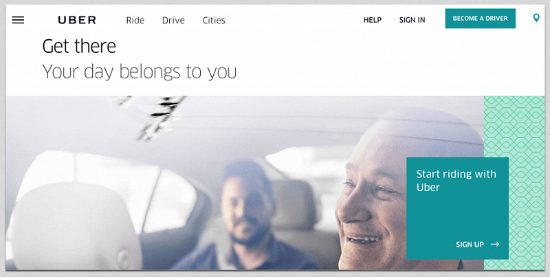
Uber: Get There
Landing pages should not be complicated, but they must exploit the little space they have to make an impression in the mind of the user.
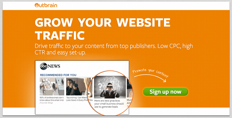
Outbrain: Grow Your Website traffic
Your copy should be sold with benefits and assist with features while not overlooking how the product works.
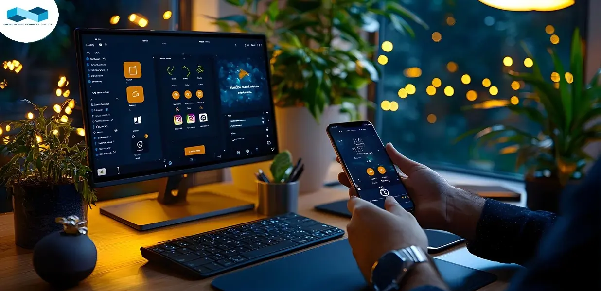
Include Images and Videos
Images and videos attract readers, and persuasive images will lure them down to the bottom through your content.
Your image must relate directly to what you’re marketing.
If you are launching a product, then it must be in the image.
If you are marketing something less physical — particularly a software service, select an image that explains someone relishing the privileges of your service.
Attach the title to your image, and you will have an enchanting combo.
Crafting a Gripping Text
Persuade them to convert with a compelling flow of the text.
Better conversions happen only when your text is convincing.
Get your point across coherently.
Be genuine and do not go overboard with your text.
Make them feel smart, valued, motivated, and inspired.
Add Testimonials & Reviews
Social proof is a must on your landing page.
Make people aware that other businesses have made the most of your products and services.
Communicate with people in such a way that you have assisted so many businesses to achieve their company goals.
Persuade your clients to record a video testimonial so that you will have an edge over your rivals.
Quotes and a short description of your product or service work well, too.
Positive approvals from your customers give your audience the much-needed confidence that you’re an authorized company— if they are done correctly.
Marketing through the people’s mouth is the most convincing marketing technique out there that you will ever get, and customer recommendations, reviews, and approvals are your next best thing to social proof.
Avoid testimonials that are way too generic, short, and ineffective, especially stuff like:
“Wonderful Job!” — John A.
“Wow!” — Praveen K.
“We are making a lot more money now!” — Frank Q.
And my personal favorite…
“Thanks.” — Smith B.
Your testimonials must describe how your customer has been profiting from your product or service.
The more detailed the testimonial is, the more human it appears. And the more human it appears, the more believable it would be.
Here is a great example (not a real one though):
“Infiniticube had helped me overcome my uneasiness about spending money on digital marketing. They revealed to me precisely where my advertising was going wrong and where my money was being wasted and which areas I needed to improve and how we should do it and taught me how to be more profitable than other businesses. My business now has a 72% better ROI than before.” — AB De Villiers, CEO of SouthAfricanCricketTeam.com
Always remember to include their full name and business as well as details about what kind of outcomes they have achieved with your product/service.
Always use your most detailed review as a reference if your likely customer is still not confident about your product/service.
Do not engage in writing your testimonials yourself, or go on Fiverr and pick someone to do it for you because these shady things can go wrong in many ways.
If possible, ask your clients’ permission for using their LinkedIn pictures for reviews. That way it is easy to use their picture and you can access it quickly.
Think of adding more client credentials, customer logos, or both to your landing page.
Here are some guarantees you can examine:
100% Money-Back Guarantee
100% Risk-Free Guarantee
100% Satisfaction Guarantee
Lifetime Guarantee
Lowest Price Guarantee
The Free Trial
Extreme Guarantee (365-day return policy)
Employ CTAs that Make Users Take Action
Keep in mind that your call-to-action button shouldn’t be freaking out or frustrating the reader.
Make your offer apparent, short, and understandable.
Avoid technical language or complicated offers. Instead, include phrases like Join to Download, Join Now, Pick Up Here, Connect with Us for a Free Audit, etc.
The only aim of your landing page should be to either fill in the form field, download an eBook, or take some other action.
Every single detail about the page — graphics, layout, or text— must follow collectively with one call to action.
Declutter your landing page.
Use some handy landing page analyzer tools to learn where you stand with your landing page.
Place a clear CTA where your visitors' first glance goes; therefore, you can increase your chances of getting a higher conversion rate.
An important note to consider is that added content does not sidetrack the user from purchasing.
It should also be fairly close to skimming reading and eliminating any obstacles to conversions.
Let’s look at some real examples of this strategy.
A number of other supporting content items are available, all with the intent of:
Boosting sales.
Improve average order values.
Encouraging users to act quickly.
This simple landing page design lacks one direct call-to-action that directs visitors to what to do next. Multiple CTAs generate uncertainty among customers, which causes fewer leads.
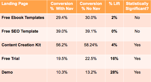
Research reveals that landing pages with one link resulted in an average conversion rate of 13.5%, on the other hand, pages with two to four links caused an average conversion of 11.9%. For five or more links, conversions plummeted even lower to 10.5%.
The following things are also of particular importance while designing a landing page:
Color — Your CTA button should contrast in color to the background. In general, colors such as orange, blue, or green CTAs work very well.
Size — The size of the CTA button should not be so small or should not be so big. It should be the right size to sync with the layout.
Message — It’s the message that genuinely highlight the value of the CTA. Try to inculcate a much-needed urgency for a product/service to enhance conversion rates.
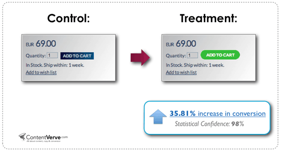
You can make a world of difference with CTA optimization:
So, as you probably guessed, a good CTA is particularly of great value. It’s not ‘just a button’. It needs to be given proper consideration, understanding, knowledge, awareness, thought, and design time.
Let's see how you can do that…
Employ imperative language in your CTA copy (buy, join, get, start, download)
CTA must be highlighted from the rest of the page
Instill a sense of instant gratification
Here are some great samples:
A really poor example:
The third factor to add to your CTA is an instant sense of gratification.
Words that put forward a sense of instant gratification:
Now
Instantly
Get
Buy
Today
Quick
Results
Overnight
Kickstart
Words that indicate prolonged gratification and demotivate visitors:
Your goal should be to strip your landing pages up to the minimum necessary. In other words, forsaking the sidebar, too. The more alternatives you give your customers, the more competition you will have for your call-to-action button.
Don’t give any room to make any mistakes.
Here are some distractions:
Enormous number of navigation links (home / blog / contact)
Provide information about a little more than the offer, for example, check out our latest blog posts!
Exasperating opt-in pop-ups
First of all, you need to cut down on navigation links. It’s an old hack, but the data is truly there to support the argument:
Remove all your announcements and the latest blog posts alongside your main CTA.
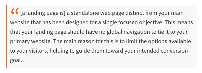
As Unbounce says:
See how clear the following simple landing page design on their website is?
No rubbish!
Nothing at all!
A simple CTA button that pops-up like a million dollars out of everything.
It's safe to say that they’ve A/B tested it to death!
Lastly, you need to disable pop-ups on your landing page.
Learn From Your Competitors
Draw inspiration from your rivals that are significantly bigger and better than yours
Take note of your competitors’ marketing departments strategies.
Make the most of their knowledge, but don’t jump into copying their designs and text.
Note and analyze which elements and maneuverings make their pages so inviting. Once you come to know how a successful and simple landing page design operates, you can reproduce the same magic with your landing pages.
Make Your Landing Page Visually Interesting
A picture is worth a thousand words, and that is enough to say how important it is to have a visually appealing landing page.
Visuals are worth many more conversions.
Powerful images, explainer videos, and animated GIFs are excellent examples of a visually appealing landing page.
The arrangement of an image can have implications on where people converge their attention, so use images wisely, if possible, to run a test to see the performance of your landing page conversion rates.
Ensure your videos and animations on your landing page don’t slow down your page load time. The ideal page load time should not go past three seconds.
It’s essential to add multimedia ingredients and get some life to your landing pages. Research reveals that practicing videos on landing pages can boost conversion rate by 86%.
Remember, pep up your landing pages to make them more visually attractive, but don’t exaggerate it.
Always prefer a simplistic and tidy layout over a page with too many unnecessary elements.
Each A/B test should perform only one change per element.
Multiple elements make the complete process untidy and unruly without knowing which element impacted your performance.
Collect data and understand your audience before you apply the changes. Based on that, you can see how one particular change is performing and how it is improving your conversion rate via A/B testing.
Every minor detail impacts your landing page conversion rate so do not ignore it while testing.
Test your landing pages whenever (which I recommend pretty often) it is possible to measure what is working and what isn’t.
A/B and multivariate testing can clear all the confusion that you have about your website creation and its guests.
In conclusion
I have covered as many aspects as I can about landing page errors and what things you can add — the above list is certainly not complete.
However, I have covered the key aspects of the landing page and the common problems people face while designing it.
High-Converting Landing Pages Checklist
Your 13-point checklist for extremely high-converting landing pages:
Know Your Campaign Goals
Know Who You Are Talking To (Target Audience)
Write Simple Headlines
Use a Copy that shows You Know Your Customers Challenges
Include Images and Videos
Crafting a Gripping Text
Make Your Offer Clear
Add Testimonials & Reviews
Employ CTAs that Make Users Take Action
Minimize Distractions
Learn From Your Competitors
Make Your Landing Page Visually Interesting
Test! Test! Test!
A few other notable mentions are:
Adopt the same language and tone your readers use
Maintain minimum word count
Add a phone number
Offer a money-back guarantee
Incorporate a photo of a human
Social proof
Use imperative language in your CTA copy (buy, join, get, start, download)
Make it stand out from the rest of the page
Create a sense of urgency
Maintain the conversation going on in your reader’s head
Cut navigation links off the page
Delete anything that is not related to your offer
Disable pop-ups on the landing page
Wipeout any unnecessary form fields
Break your form into small steps if they haveto be long
Try different form lengths
Use contrasting colors
Use scarcity techniques
Here are some important signals on how you can modify your simple landing page design service to boost conversions:
Customize your landing pages with your visitors on the back of your head.
Employ chatbots for 24/7 live chat, expertise supply, and business assistance.
Begin a culture of testing to improve micro and macro goal accomplishments.
Don’t assume everyone buys your product instantly.
Get your forms and headings to work harder for you.
I hope my article helped you identify a few improvements you can make to your own landing pages.
While poor conversion rates may disappoint you, you can make a few minor adjustments and see outcomes quickly, but if you think building your own landing page is too much work, then you can always take the help of landing page companies or the best landing page software.
Digital Marketing Specialist at Infiniticube, a leading app development and digital marketing agency in India. I specialize in B2B lead generation, AI-driven marketing solutions, and blockchain technology. Follow along for actionable insights on software trends and digital growth strategies for 2025 and beyond.
Our newsletter is finely tuned to your interests, offering insights into AI-powered solutions, blockchain advancements, and more. Subscribe now to stay informed and at the forefront of industry developments.


 June 27, 2025
 Balbir Kumar Singh
 1
1


I appreciate you sharing this blog post. Thanks Again. Cool.